
Introduction
When you write CSS, the browser does not just display the final page.
It can also show you how the page was built.
Browser developer tools let you inspect HTML elements, view CSS rules, edit styles temporarily, test layout changes, and find out which CSS is active.
This is useful when:
a style is not applyinga layout looks wrongspacing is unexpecteda colour is being overriddena rule is crossed outan element is too wide or too narrowa stylesheet is not loadinga responsive layout behaves differently than expectedDeveloper tools are one of the most useful parts of learning CSS.
They let you see what the browser actually understands, not just what you think the code says.
What Are Browser Developer Tools?
Browser developer tools are built-in tools that help you inspect, test, and debug web pages.
Most modern browsers include them.
You can use developer tools to examine:
HTML structureCSS rulescomputed styleslayout boxesspacingcoloursfontsloaded filesconsole messagesnetwork requestsresponsive behaviourFor CSS, the most important parts are usually:
Elements panelStyles panelComputed panelBox model viewDevice toolbarNetwork panelThe exact names may vary slightly between browsers, but the general ideas are similar.
How to Open Developer Tools
In most browsers, you can open developer tools by right-clicking part of the page and choosing:
InspectYou can also usually use a keyboard shortcut.
Common shortcuts include:
F12Ctrl + Shift + I on Windows or LinuxCmd + Option + I on macOSIf you right-click a specific heading, paragraph, image, button, or section and choose Inspect, the browser usually opens developer tools with that element selected.
This is the fastest way to inspect a specific part of the page.
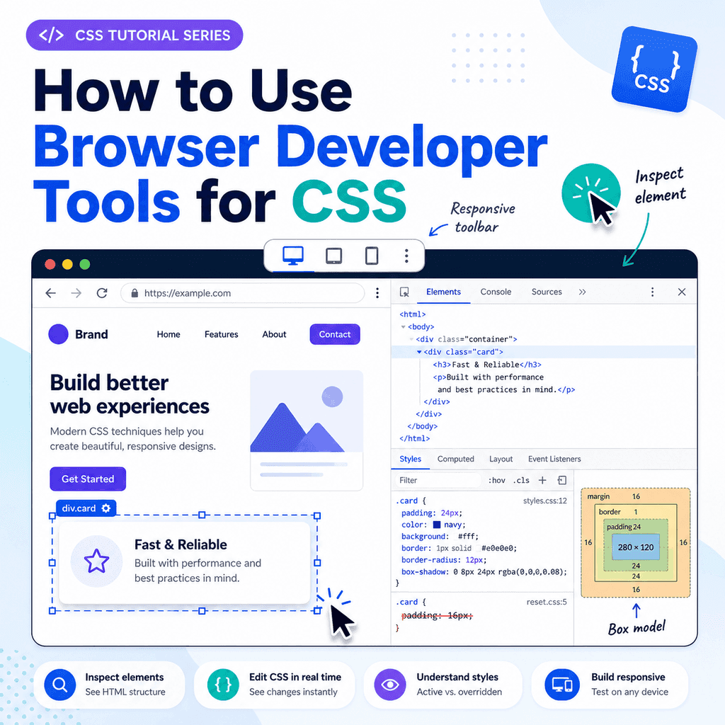
The Elements Panel
The Elements panel shows the HTML structure of the page.
For example, you might see:
<body> <main class=”container”> <h1>Welcome</h1> <p class=”intro”>This is the introduction.</p> </main></body>This view shows the document as the browser understands it.
This matters because the browser may repair invalid HTML.
For example, if your HTML has bad nesting, the browser may rearrange the document structure.
The Elements panel helps you check what the browser is actually using.
Selecting an Element
To inspect an element, use the element picker tool.
It usually looks like a mouse pointer or cursor icon.
After selecting it, click an element on the page.
For example, click a heading:
<h1>Welcome</h1>The browser selects that heading in the Elements panel.
The Styles panel then shows the CSS rules that apply to it.
This is useful because it connects the visible page to the HTML and CSS behind it.
The Styles Panel
The Styles panel shows CSS rules that apply to the selected element.
For example, if you inspect this paragraph:
<p class=”intro”>This is the introduction.</p>you might see CSS like this:
.intro { font-size: 1.2rem; color: navy;} p { line-height: 1.6;}The Styles panel helps you answer important questions:
Which CSS rules apply to this element?Which stylesheet did the rule come from?Which declarations are active?Which declarations are being overridden?Which styles are inherited?This is often the first place to look when CSS is not behaving as expected.
Active Rules
An active CSS rule is a rule currently affecting the selected element.
For example:
h1 { color: navy;}If the inspected <h1> appears navy, this rule is active.
Developer tools usually show active declarations normally.
If a declaration is not active, it may be crossed out.
This visual feedback helps you understand which CSS is actually being used.
Crossed-Out CSS Rules
Sometimes a CSS declaration appears crossed out.
For example:
h1 { color: black;}may be crossed out because another rule overrides it:
.page-title { color: navy;}HTML:
<h1 class=”page-title”>Welcome</h1>The class selector is more specific than the element selector, so the heading appears navy.
The crossed-out color: black; rule shows that the declaration exists but is not the one currently winning.
Why CSS Gets Overridden
CSS can be overridden for several reasons.
Common causes include:
a more specific selectora later rule in the stylesheetan inline stylea media querya browser default stylean inherited valuean invalid declarationFor example:
p { color: black;} .intro { color: blue;}HTML:
<p class=”intro”>This is the introduction.</p>The paragraph appears blue because .intro is more specific than p.
Developer tools help you see that relationship directly.
Editing CSS in Developer Tools
You can temporarily edit CSS inside developer tools.
For example, if you inspect this rule:
h1 { color: navy;}you can click the value navy and change it to:
darkgreenThe page updates immediately.
This lets you test changes without editing your actual CSS file first.
However, changes made in developer tools are usually temporary.
If you refresh the page, the changes may disappear unless you copy them into your real CSS file.
Adding a New CSS Declaration
Developer tools usually let you add new declarations.
For example, you might inspect a card:
<article class=”card”> <h2>Featured Lesson</h2> <p>Learn how CSS works.</p></article>Then add:
.card { padding: 24px; border: 1px solid #cccccc;}The browser applies the changes immediately.
This is a good way to experiment with spacing, borders, colours, widths, and layout.
When you find a change that works, copy it back into your stylesheet.
Turning CSS Declarations On and Off
Developer tools often show checkboxes beside CSS declarations.
For example:
.card { padding: 24px; border: 1px solid #cccccc; background-color: white;}You can untick a declaration to disable it temporarily.
For example, disabling:
border: 1px solid #cccccc;lets you see how the card looks without the border.
This is useful for debugging.
It helps you find which declaration is causing a visual effect.
Finding Unexpected Spacing
Unexpected spacing is one of the most common CSS problems.
For example, a page may have extra space around the edge.
This often comes from the browser’s default body margin:
body { margin: 8px;}In developer tools, inspect the <body> element.
The Styles or Computed panel may show the body margin.
To remove it in your CSS, write:
body { margin: 0;}Developer tools help you confirm whether spacing comes from margin, padding, border, gap, or another property.
The Box Model View
The box model view shows the size and spacing of an element.
It usually displays:
contentpaddingbordermarginThese are the main parts of the CSS box model.
For example, an element might have:
.card { width: 300px; padding: 20px; border: 2px solid #cccccc; margin: 24px;}The box model view helps you see how much space each part uses.
This is useful when an element is larger than expected or too close to nearby content.
Margin in Developer Tools
Margin is space outside an element.
For example:
p { margin-bottom: 16px;}If you inspect a paragraph, developer tools can show the margin area around it.
Many browsers highlight margin in one colour when you hover over the box model diagram or the element on the page.
This helps you see exactly where the space is coming from.
If two elements seem too far apart, inspect them and check their margins.
Padding in Developer Tools
Padding is space inside an element.
For example:
.card { padding: 24px;}If text inside a card is far from the edge, padding may be the reason.
Developer tools can show the padding area.
This is useful because margin and padding can look similar visually, but they are not the same.
Margin is outside the element.
Padding is inside the element.
The Computed Panel
The Computed panel shows the final calculated styles for an element.
This is useful because CSS can come from many places.
For example, an element’s final color might be affected by:
browser default stylesstyles inherited from a parentelement selectorsclass selectorsID selectorsmedia queriesinline stylesThe Computed panel shows the final result after the browser has resolved everything.
For example, it might show:
color: rgb(0, 0, 128);font-size: 32px;margin-bottom: 16px;This tells you what the browser is actually using.
Finding Where a Computed Style Came From
In many browsers, the Computed panel lets you expand a property.
For example, expand:
font-sizeThe browser may show which rule set that value.
This helps answer questions such as:
Why is this text so large?Where did this margin come from?Which stylesheet set this colour?Why is this element display flex?This is especially useful when working with larger CSS files or third-party stylesheets.
User Agent Stylesheets
Developer tools can also show user agent stylesheet rules.
These are the browser’s default styles.
For example, if you inspect an <h1> with no custom CSS, you may see rules similar to:
h1 { display: block; font-size: 2em; font-weight: bold; margin-block-start: 0.67em; margin-block-end: 0.67em;}These styles come from the browser.
They explain why headings are large and why paragraphs and lists have default spacing.
Your own CSS can override user agent styles.
Inspecting Classes and IDs
Developer tools show the selected element’s attributes.
For example:
<section id=”contact” class=”page-section contact-section”>This tells you that the element has:
id=”contact”class=”page-section contact-section”This is useful when checking whether your CSS selector matches the HTML.
For example, this selector:
.contact-section { padding: 32px;}will match the element.
This selector:
.contact { padding: 32px;}will not match unless the element has class="contact".
Developer tools help you spot mismatched names.
Checking Whether a Selector Matches
If a CSS rule is not applying, check whether the selector matches the HTML.
For example, CSS:
.card-title { color: navy;}HTML:
<h2 class=”card-heading”>Featured Lesson</h2>The selector .card-title will not apply because the HTML uses card-heading.
Developer tools show the actual class on the element.
This helps you find spelling mistakes, missing classes, wrong IDs, and incorrect selectors.
Testing Classes in Developer Tools
You can usually edit the HTML attributes inside the Elements panel.
For example, you might change:
<p>This is a paragraph.</p>to:
<p class=”intro”>This is a paragraph.</p>If your CSS contains:
.intro { font-size: 1.2rem; font-weight: bold;}the paragraph will update immediately.
This is useful for testing whether a class gives the effect you expect.
Again, changes in developer tools are usually temporary.
Copy useful changes into your actual HTML or CSS files.
Inspecting Hover Styles
Some styles only appear when the user hovers over an element.
Example:
a:hover { text-decoration: underline;}Developer tools can usually force an element into a state such as:
hoverfocusactivevisitedThis lets you inspect styles that would otherwise disappear when you move the mouse.
For example, you can force a button into :hover state and check which hover styles apply.
Inspecting Focus Styles
Focus styles are important for keyboard navigation.
Example:
button:focus { outline: 2px solid #0055cc;}Developer tools can help you inspect focus styles.
You can use the keyboard to tab to an element, or use the tool to force the focus state.
Check that focused links, buttons, and form controls are clearly visible.
Avoid removing focus styles without adding a clear replacement.
Finding Active Media Queries
Responsive CSS often uses media queries.
Example:
@media (max-width: 700px) { nav { display: block; }}Developer tools can show when a media query is active.
If a rule only applies at certain screen widths, it may appear or disappear as you resize the browser.
This helps you debug responsive layouts.
For example, if a mobile navigation style is not applying, check whether the viewport width matches the media query.
Using the Device Toolbar
Most developer tools include a device toolbar or responsive design mode.
This lets you test the page at different screen sizes.
You can use it to check:
mobile layoutstablet layoutsdesktop layoutsresponsive imagesnavigation changesmedia queriestouch target spacinghorizontal scrollingFor example, if your CSS has:
@media (max-width: 600px) { .cards { display: block; }}you can resize the viewport below 600 pixels and check whether the rule becomes active.
Checking for Horizontal Scrolling
Horizontal scrolling often means something is too wide for the viewport.
Developer tools can help identify the cause.
Common causes include:
fixed-width containerslarge imageslong unbroken textwide tableslarge marginsgrid or flex items that cannot shrinkFor example:
.container { width: 1200px;}This may overflow on mobile screens.
A more flexible version is:
.container { width: 90%; max-width: 1200px;}Use the device toolbar and box model view to find elements that exceed the screen width.
Inspecting Flexbox Layouts
Developer tools can help inspect Flexbox.
For example:
.cards { display: flex; gap: 16px;}When you inspect an element with display: flex, many browsers show a Flexbox badge or overlay.
This can help you see:
main axiscross axisitem spacingalignmentgapsflex item sizeswrappingThis is useful when items are not aligning as expected.
Inspecting Grid Layouts
Developer tools can also inspect CSS Grid.
Example:
.layout { display: grid; grid-template-columns: 2fr 1fr; gap: 24px;}Many browsers can display grid overlays.
These overlays show:
grid linescolumnsrowsgapsareasitem placementIf a grid item appears in the wrong place, the grid overlay can help you understand why.
Checking Loaded Stylesheets
Sometimes CSS does not apply because the stylesheet did not load.
The Network panel can help.
Open developer tools, go to the Network panel, and reload the page.
Look for your CSS file, such as:
styles.cssIf it shows a 404 error, the file path is wrong or the file is missing.
For example, this link:
<link rel=”stylesheet” href=”css/styles.css”>will fail if there is no css folder or no styles.css file inside it.
Checking the Source of a CSS Rule
In the Styles panel, CSS rules usually show a file name and line number.
For example:
styles.css:24This means the rule came from line 24 of styles.css.
This is useful when a project has multiple CSS files.
You can see whether a rule came from:
your stylesheeta reset stylesheeta browser default stylesheeta CSS frameworkan inline stylea style element in the HTMLKnowing where a rule came from makes debugging much easier.
Inline Styles in Developer Tools
Inline styles appear directly on an element.
Example:
<h1 style=”color: red;”>Welcome</h1>In developer tools, inline styles are usually shown near the top of the Styles panel.
They can override many stylesheet rules.
For example:
h1 { color: navy;}may be overridden by:
<h1 style=”color: red;”>If a style will not change, check whether an inline style is overriding it.
Invalid CSS in Developer Tools
If a CSS declaration is invalid, developer tools may show a warning or cross it out.
Example of invalid CSS:
p { color navy;}This is missing a colon.
Correct:
p { color: navy;}Another invalid example:
p { font-size: largepx;}The value largepx is not valid.
Developer tools can help identify these problems.
Testing Colours
Developer tools often include a colour picker.
For example, if you inspect:
button { background-color: #0055cc;}you may be able to click the colour square and choose another colour.
This is useful for testing colour changes quickly.
However, remember to consider contrast and readability.
A colour that looks attractive may still be hard to read if contrast is poor.
Testing Font Sizes
You can change font sizes directly in the Styles panel.
For example:
h1 { font-size: 2rem;}Try changing 2rem to:
2.5remor:
1.75remThe page updates immediately.
This is useful for adjusting typography before copying the final value into your CSS file.
Testing Spacing
Developer tools are especially useful for spacing.
You can test:
marginpaddinggapline-heightwidthheightmax-widthFor example, inspect a section and try:
padding: 32px;Then change it to:
padding: 48px;This helps you find a value that looks right.
After testing, copy the final declaration into your real stylesheet.
Testing Display Values
The display property controls layout behaviour.
Examples:
display: block;display: inline;display: flex;display: grid;display: none;Developer tools let you test display changes quickly.
For example, changing:
display: block;to:
display: flex;can help you see whether Flexbox is appropriate for a layout.
Be careful with display: none;, because it hides the element.
Searching CSS Rules
Developer tools usually let you search inside the page source or styles.
You can search for:
a class namean IDa propertya colour valuea CSS file nameFor example, if an element uses:
class=”lesson-card”search for:
lesson-cardThis can help you find where the class is styled.
In larger projects, search is often faster than scrolling through files manually.
Debugging a Style That Does Not Apply
If a style does not apply, use this process.
First, inspect the element.
Then check whether the CSS selector matches the HTML.
For example:
.card-title { color: navy;}will not affect:
<h2 class=”card-heading”>Lesson Title</h2>Next, check whether the declaration is crossed out.
If it is crossed out, another rule is overriding it.
Then check whether the CSS file loaded.
If the file did not load, fix the file path.
Finally, check for invalid CSS syntax.
Debugging Unexpected Layout
If a layout looks wrong, inspect the element and check:
displaywidthmax-widthheightmarginpaddingborderbox-sizingpositionoverflowflex propertiesgrid propertiesmedia queriesFor example, if an element is too wide, check whether it has a fixed width:
width: 1200px;A more responsive version might be:
width: 100%;max-width: 1200px;Developer tools help you identify the exact property causing the problem.
Debugging CSS File Problems
If none of your CSS appears to work, check the stylesheet link.
HTML:
<link rel=”stylesheet” href=”styles.css”>Then check:
is the file name correct?is the folder path correct?is rel=”stylesheet” included?is the CSS file saved?is the HTML file saved?is the browser loading an old cached version?Use the Network panel to confirm whether the file loaded.
If the CSS file returns 404, the path is wrong or the file is missing.
Temporary Changes Are Not Saved Automatically
Changes in developer tools are normally temporary.
For example, if you change:
h1 { color: navy;}to:
h1 { color: darkgreen;}inside developer tools, the page updates.
But if you refresh the page, the change may disappear.
To keep the change, copy it into your real CSS file.
Developer tools are for testing and debugging.
Your actual files are where permanent changes should be saved.
A Simple Practice Exercise
Create this HTML:
<!DOCTYPE html><html lang=”en”><head> <meta charset=”UTF-8″> <title>Developer Tools Practice</title> <link rel=”stylesheet” href=”styles.css”></head><body> <main class=”container”> <h1 class=”page-title”>Developer Tools Practice</h1> <p class=”intro”> Inspect this paragraph and test changes in the browser. </p> <article class=”card”> <h2>Practice Card</h2> <p>Use developer tools to inspect margin, padding, colour, and font size.</p> </article> </main> </body></html>Add this CSS:
body { margin: 0; font-family: Arial, sans-serif; line-height: 1.6;} .container { width: 90%; max-width: 900px; margin: 0 auto; padding: 40px 0;} .page-title { color: navy;} .intro { font-size: 1.2rem;} .card { padding: 24px; border: 1px solid #cccccc;}Then open the page in a browser and inspect the elements.
Try changing the heading colour, card padding, paragraph font size, and container width.
What to Practise in Developer Tools
Practise these actions:
inspect a headinginspect a paragraphfind the active CSS ruleturn a declaration off and onchange a colourchange font sizechange paddingcheck the box modelcheck computed stylesforce hover or focus stateresize the viewportcheck whether the CSS file loadedThese skills are used constantly when writing CSS.
Common Mistake: Editing Only in Developer Tools
Developer tools are useful for testing, but they do not usually save changes to your project files.
If you make a good change in the browser, copy it into your CSS file.
Otherwise, the change will be lost when the page reloads.
A good workflow is:
test in developer toolscopy the final CSSpaste it into your stylesheetsave the stylesheetrefresh the pagecheck the resultCommon Mistake: Ignoring Crossed-Out Rules
A crossed-out rule is important.
It means the rule exists, but it is not currently active.
Do not assume the browser is ignoring your CSS randomly.
Usually, another rule is winning.
Check selector specificity, rule order, media queries, and inline styles.
Developer tools show which rule is active.
Common Mistake: Looking Only at Your CSS File
A page may be affected by more than one stylesheet.
For example:
browser user agent stylesheetreset stylesheetmain stylesheetcomponent stylesheetframework stylesheetinline stylesDeveloper tools show all matching rules.
This is more reliable than looking only at one CSS file.
Common Mistake: Forgetting Media Queries
A style may not apply because its media query is not active.
Example:
@media (max-width: 600px) { .menu { display: block; }}This rule applies only when the viewport is 600 pixels wide or less.
If the viewport is wider, the rule is inactive.
Use the device toolbar to test different widths.
Common Mistake: Misreading Margin and Padding
Margin and padding both create space, but they are different.
Margin is outside the element.
Padding is inside the element.
Use the box model view to see which one is causing the space.
Do not guess.
Inspect the element and check the box model.
Common Mistake: Not Checking Whether the CSS File Loaded
If nothing is styled, do not start by rewriting your CSS.
First check whether the stylesheet loaded.
Use the Network panel or Sources panel.
If the browser cannot find the CSS file, no CSS rule inside it will apply.
Fix the file path before debugging individual rules.
Best Practices
Use Inspect to select elements directly from the page.
Check the Styles panel to see active CSS rules.
Look for crossed-out declarations.
Use the Computed panel to see final values.
Use the box model view to understand margin, padding, border, and content size.
Temporarily edit CSS to test ideas.
Copy useful changes into your real stylesheet.
Use the Network panel to check whether CSS files loaded.
Use responsive design mode to test media queries.
Use hover and focus state tools to inspect interactive styles.
Do not remove focus styles unless you replace them clearly.
Debug one issue at a time.
Use developer tools to confirm evidence instead of guessing.
Summary
Browser developer tools help you inspect and debug CSS.
You can use them to inspect elements, view active rules, edit styles temporarily, and understand why a page looks the way it does.
The Elements panel shows the HTML structure.
The Styles panel shows CSS rules applied to the selected element.
The Computed panel shows final calculated styles.
The box model view shows margin, border, padding, and content size.
Developer tools can help you find:
overridden CSSunexpected spacingwrong selectorsinvalid declarationsmissing stylesheetsactive media querieslayout problemsbrowser default stylesThe main idea is simple:
Do not guess what CSS is doing.Inspect it.Once you learn to use developer tools, CSS becomes much easier to understand, test, and debug.