
Introduction
Browsers apply their own default styles to HTML elements.
That is why a page with no custom CSS still has spacing, headings, bullets, blue links, form field styles, and button styles.
These default styles come from the browser’s user agent stylesheet.
For example, browsers commonly give the <body> element a small margin:
body { margin: 8px;}They also give paragraphs, headings, lists, buttons, and form controls their own default appearance.
These defaults are useful because they make plain HTML readable.
However, they can also make design less predictable.
Different browsers may apply slightly different defaults.
That is why many developers use reset styles or normalisation styles.
Both approaches try to create a more reliable starting point for writing CSS.
What Problem Do Resets and Normalisation Solve?
When you write HTML, the browser applies default styles before your own CSS.
For example:
<h1>Welcome</h1><p>This is a paragraph.</p><ul> <li>HTML</li> <li>CSS</li></ul>Even without a stylesheet, this content has visible styling.
The heading is large and bold.
The paragraph has spacing.
The list has bullets and indentation.
The body has space around the page.
This is because the browser has built-in CSS.
The problem is that default styles are not always exactly the same across browsers.
They may also not match the design you want.
A reset or normalisation stylesheet helps you take more control.
What Is a CSS Reset?
A CSS reset is a group of CSS rules that removes many browser default styles.
The goal is to reduce or remove the browser’s built-in styling so you can build your own design from a cleaner base.
A very simple reset might look like this:
* { margin: 0; padding: 0;}This removes default margin and padding from every element.
That means headings, paragraphs, lists, and other elements no longer keep their usual default spacing.
This gives you more control, but it also means you must add spacing back yourself.
What Reset Styles Do
Reset styles usually remove or reduce default browser styling.
They may reset things such as:
marginpaddingborderfont sizinglist stylingtable spacingform control stylingdefault line heightsFor example:
h1,h2,h3,p,ul,ol { margin: 0;}This removes default margins from headings, paragraphs, and lists.
Another example:
ul,ol { padding: 0; list-style: none;}This removes list indentation and bullets or numbers.
That might be useful for navigation menus.
However, it may not be useful for normal article content.
Why Resets Can Be Useful
A reset can make CSS more predictable.
For example, if all default margins are removed, you can decide exactly how much space each element should have.
Instead of relying on browser defaults, you write your own spacing system:
h1 { margin-bottom: 24px;} p { margin-bottom: 16px;} section { margin-bottom: 48px;}This can make layouts easier to control.
It can also make a website feel more consistent.
For larger projects, this consistency is valuable.
Why Resets Can Cause Problems
A reset can also remove useful styles.
For example, this reset removes all list styling:
ul,ol { list-style: none; padding: 0;}That might be helpful for a navigation menu:
<nav> <ul> <li><a href=”index.html”>Home</a></li> <li><a href=”about.html”>About</a></li> </ul></nav>But it may be unhelpful for normal content:
<ul> <li>First important point</li> <li>Second important point</li> <li>Third important point</li></ul>If the bullets disappear from all lists, users may find the content harder to read.
A reset gives you control, but it can also remove useful browser behaviour.
What Is Normalisation?
Normalisation is a gentler approach.
Instead of removing most browser defaults, normalisation tries to make default styles more consistent across browsers.
The aim is not to erase everything.
The aim is to preserve useful defaults while reducing browser differences.
For example, a normalisation stylesheet may keep headings bold, lists indented, and form controls usable.
But it may adjust inconsistent margins, font behaviour, or display settings.
A normalisation stylesheet gives you a more reliable base without stripping the page down completely.
Reset vs Normalisation
A reset and a normalisation stylesheet are related, but they are not the same.
A reset usually removes default styling.
Normalisation usually preserves useful defaults and makes them more consistent.
A simple comparison:
CSS reset:– removes many browser defaults– gives you a blanker starting point– requires you to add styles back– can be more aggressive CSS normalisation:– keeps useful browser defaults– reduces inconsistencies between browsers– gives a more stable starting point– is usually less aggressiveNeither approach is automatically better in every situation.
The right choice depends on the project.
A Page Without a Reset
Here is a simple page with no reset:
<!DOCTYPE html><html lang=”en”><head> <meta charset=”UTF-8″> <title>No Reset Example</title></head><body> <h1>Page Title</h1> <p> This paragraph uses the browser’s default spacing. </p> <ul> <li>First item</li> <li>Second item</li> </ul> </body></html>The browser applies default styles.
The body has margin.
The heading has margin and large text.
The paragraph has vertical spacing.
The list has bullets and indentation.
This is readable without any custom CSS.
A Page With a Basic Reset
Now imagine adding this CSS:
* { margin: 0; padding: 0;}The same page will look very different.
The body edge spacing disappears.
The heading and paragraph spacing disappears.
The list indentation disappears.
The bullets may still appear, but they may be pushed against the edge because padding has been removed.
The page may feel cramped unless you add new spacing.
This is why resets should be used carefully.
A Small Practical Reset
For many small projects, a small reset is enough.
Example:
* { box-sizing: border-box;} body { margin: 0;} img { max-width: 100%; height: auto;} button,input,select,textarea { font: inherit;}This reset does four useful things.
It makes sizing easier with box-sizing.
It removes the default body margin.
It makes images responsive by default.
It makes form controls inherit the page font.
This is less aggressive than removing all margin and padding from every element.
The box-sizing Reset
One common reset rule is:
* { box-sizing: border-box;}By default, CSS uses:
box-sizing: content-box;This means an element’s width does not include padding and border.
For example:
.card { width: 300px; padding: 20px; border: 2px solid #cccccc;}With the default box model, the total visible width becomes more than 300px.
With border-box, the padding and border are included inside the declared width.
This often makes layouts easier to manage.
A more complete version is:
*,*::before,*::after { box-sizing: border-box;}This also applies the rule to pseudo-elements.
Removing Body Margin
Browsers commonly apply margin to the body.
That is why plain HTML often has space around the edge of the page.
A common reset rule is:
body { margin: 0;}This removes the default body margin.
Then you can create your own layout spacing:
main { width: 90%; max-width: 1000px; margin: 0 auto; padding: 32px 0;}This gives you deliberate spacing rather than browser-provided spacing.
Making Images Responsive
Images can overflow their containers if they are larger than the available space.
A useful base rule is:
img { max-width: 100%; height: auto;}This allows images to shrink to fit their container.
The height: auto keeps the image proportions correct.
This is not exactly a browser reset, but it is often included in base CSS because it prevents a common layout problem.
Making Form Controls Inherit Fonts
Form controls can use browser or operating system fonts by default.
That can make them look different from the rest of the page.
A useful normalising rule is:
button,input,select,textarea { font: inherit;}This tells form controls to use the same font settings as the surrounding page.
It often makes forms look more consistent.
However, the controls still keep much of their native behaviour and usability.
Resetting Lists Carefully
Some developers reset lists like this:
ul,ol { list-style: none; padding: 0; margin: 0;}This removes bullets, numbers, indentation, and spacing from all lists.
That can be too broad.
A better approach is to reset lists only when needed.
For example, for navigation:
.site-nav ul { list-style: none; padding: 0; margin: 0;}This removes list styling only inside .site-nav.
Normal content lists can keep their bullets and indentation.
This is more controlled.
Resetting Buttons Carefully
Buttons have browser default styles.
Some resets remove most button styling:
button { background: none; border: 0; padding: 0;}This can be useful for highly customised buttons.
But it can also remove the visual cues that make a button look clickable.
If you reset buttons, add clear styles back:
button { font: inherit; padding: 10px 16px; border: 1px solid #333333; border-radius: 6px; cursor: pointer;}A button should still look and behave like an interactive control.
Do Not Remove Focus Styles Without Replacing Them
Some resets include rules that remove outlines:
:focus { outline: none;}Avoid this unless you provide a clear replacement.
Focus styles help keyboard users see which element is active.
A better approach is:
:focus { outline: 2px solid #0055cc; outline-offset: 2px;}Or, for modern browsers:
:focus-visible { outline: 2px solid #0055cc; outline-offset: 2px;}Do not remove important accessibility features just to make a design look cleaner.
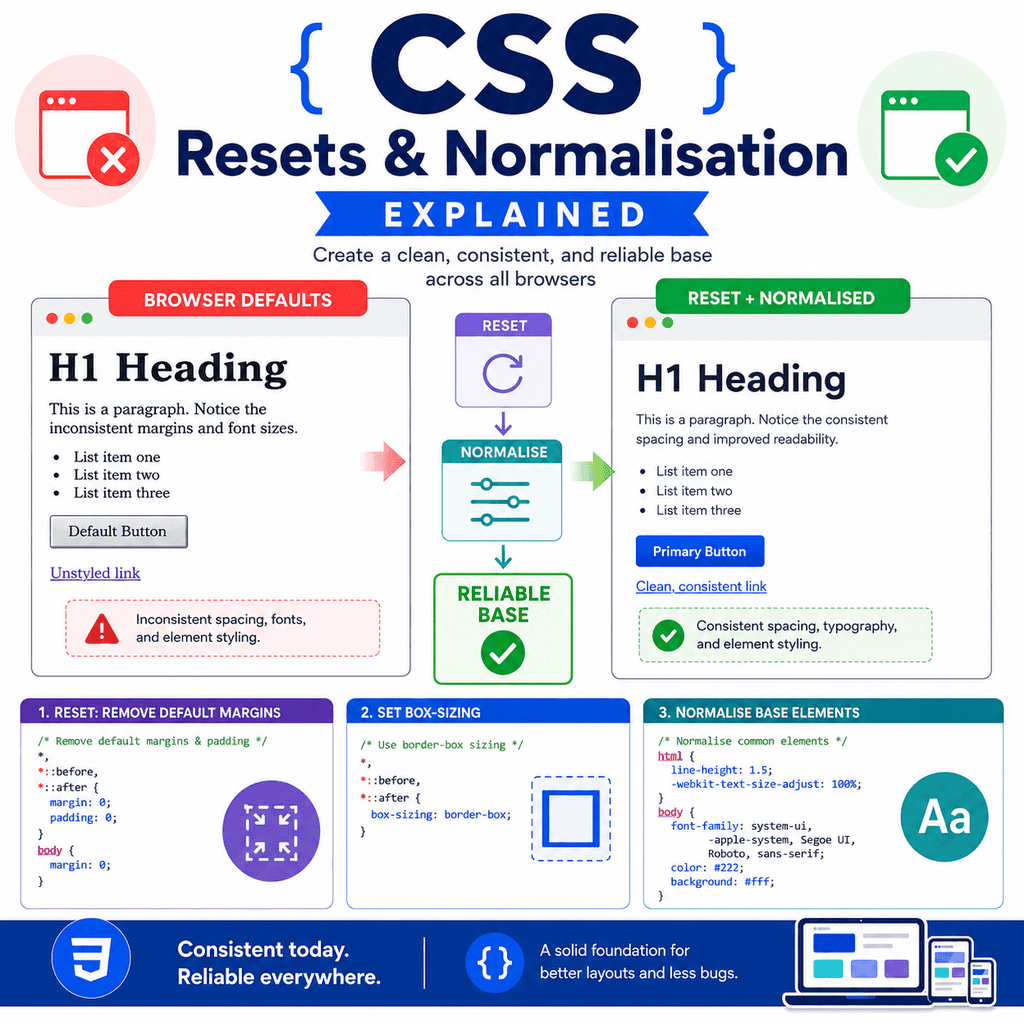
Creating a Reliable Base
A reliable base is a small set of CSS rules that gives your project a predictable starting point.
It does not need to remove everything.
It should solve common problems and support the rest of your stylesheet.
A useful base might include:
box-sizing rulesbody margin resetdefault font settingsresponsive image rulesform control font inheritancesensible line heightclear focus stylesbasic media behaviourThe goal is not to fight the browser.
The goal is to create a consistent foundation.
A Simple Reliable Base CSS
Here is a practical base stylesheet:
/* Use a more predictable box model */*,*::before,*::after { box-sizing: border-box;} /* Remove default body margin and set basic text styles */body { margin: 0; font-family: Arial, sans-serif; line-height: 1.6; color: #222222;} /* Keep images from overflowing their containers */img,picture,video,canvas,svg { max-width: 100%; height: auto;} /* Make form controls use the page font */button,input,select,textarea { font: inherit;} /* Keep keyboard focus visible */:focus-visible { outline: 2px solid #0055cc; outline-offset: 2px;}This base is not too aggressive.
It removes some common inconsistencies while keeping many useful browser defaults.
Adding Your Own Spacing
If you remove default margins, you should add your own spacing.
For example:
h1,h2,h3,p { margin-top: 0;} p { margin-bottom: 1rem;} section { margin-bottom: 3rem;}This creates consistent spacing.
However, do not remove spacing unless you are ready to replace it.
A page with no margins or spacing can become difficult to read.
Reset Styles Do Not Replace Design
A reset does not design your website.
It only creates a starting point.
For example, this reset:
body { margin: 0;}removes body margin.
It does not choose a layout, font scale, colour scheme, spacing system, or button style.
You still need your own CSS:
.container { width: 90%; max-width: 1100px; margin: 0 auto;} .card { padding: 24px; border: 1px solid #dddddd;}Reset and normalisation styles are foundations, not finished designs.
Where to Put Reset or Base Styles
Reset, normalisation, and base styles usually go near the top of your CSS file.
Example:
/* Reset and base styles */*,*::before,*::after { box-sizing: border-box;} body { margin: 0; font-family: Arial, sans-serif;} /* Layout */.container { width: 90%; max-width: 1000px; margin: 0 auto;} /* Components */.card { padding: 24px; border: 1px solid #dddddd;}The general foundation comes first.
The more specific layout and component styles come after.
This makes the stylesheet easier to understand.
Using a Separate Reset File
Some projects use a separate reset file.
Example folder structure:
my-website/ index.html css/ reset.css styles.cssThe HTML might link both files:
<link rel=”stylesheet” href=”css/reset.css”><link rel=”stylesheet” href=”css/styles.css”>The reset file comes first.
The main stylesheet comes after.
This lets your main stylesheet build on top of the reset.
For small projects, one CSS file is usually enough.
Order Matters
If you use a reset or normalisation file, load it before your main styles.
Good order:
<link rel=”stylesheet” href=”reset.css”><link rel=”stylesheet” href=”styles.css”>Less useful order:
<link rel=”stylesheet” href=”styles.css”><link rel=”stylesheet” href=”reset.css”>If the reset loads after your main styles, it may undo some of your design rules.
The reset should create the base.
Your main CSS should customise the page after that.
A Complete Example
HTML:
<!DOCTYPE html><html lang=”en”><head> <meta charset=”UTF-8″> <title>Reset and Base CSS Example</title> <link rel=”stylesheet” href=”styles.css”></head><body> <main class=”container”> <h1>CSS Reset Example</h1> <p> This page uses a small base stylesheet to make layout and spacing more predictable. </p> <article class=”card”> <h2>Card Title</h2> <p> This card uses custom spacing and border styles after the base rules. </p> <a href=”next.html”>Read more</a> </article> </main> </body></html>CSS:
/* Reset and base styles */*,*::before,*::after { box-sizing: border-box;} body { margin: 0; font-family: Arial, sans-serif; line-height: 1.6; color: #222222;} img { max-width: 100%; height: auto;} button,input,select,textarea { font: inherit;} /* Layout */.container { width: 90%; max-width: 900px; margin: 0 auto; padding: 40px 0;} /* Typography */h1,h2,p { margin-top: 0;} p { margin-bottom: 1rem;} /* Components */.card { padding: 24px; border: 1px solid #dddddd; border-radius: 8px;}This example creates a reliable base and then adds normal page styling.
Reset Styles and the Cascade
Reset styles are still normal CSS.
They follow the cascade like any other CSS rule.
For example:
p { margin: 0;} .article p { margin-bottom: 1rem;}The first rule removes paragraph margin.
The second rule adds bottom margin back inside .article.
The cascade decides which declarations apply.
This means reset styles are not special.
They are just CSS rules placed early in the stylesheet.
Reset Styles and Accessibility
A reset should not make a page harder to use.
Be careful when resetting:
focus outlineslink stylingbutton appearanceform control appearancelist stylingtext spacingFor example, if you remove underlines from all links, users may not recognise links.
If you remove focus outlines, keyboard users may lose their place.
If you remove list bullets everywhere, content lists may become harder to scan.
A good reset improves consistency without damaging usability.
Common Mistake: Using * { margin: 0; padding: 0; } Without Adding Spacing Back
This rule removes a lot:
* { margin: 0; padding: 0;}After using it, headings, paragraphs, lists, and sections may all become cramped.
If you use this kind of reset, add spacing back deliberately:
p { margin-bottom: 1rem;} section { margin-bottom: 3rem;}Do not remove spacing unless you have a plan to replace it.
Common Mistake: Removing List Styles Globally
This can cause problems:
ul,ol { list-style: none; padding: 0;}It removes useful bullets and numbering from every list.
Better for navigation:
.site-nav ul { list-style: none; padding: 0; margin: 0;}This only affects navigation lists.
Normal article lists remain readable.
Common Mistake: Removing Focus Outlines
Avoid this:
:focus { outline: none;}Better:
:focus-visible { outline: 2px solid #0055cc; outline-offset: 2px;}Focus indicators are important.
Do not remove them unless you provide a clear replacement.
Common Mistake: Loading the Reset After the Main CSS
Incorrect order:
<link rel=”stylesheet” href=”styles.css”><link rel=”stylesheet” href=”reset.css”>Better:
<link rel=”stylesheet” href=”reset.css”><link rel=”stylesheet” href=”styles.css”>The reset should come first.
Your main styles should come after it.
Otherwise, the reset may override design rules you wanted to keep.
Common Mistake: Thinking a Reset Fixes All Browser Differences
A reset can reduce some differences, but it does not make every browser identical.
Browsers and operating systems can still differ in areas such as:
form controlsscrollbarsfont renderingline-height renderinginput appearancemedia controlsfocus behaviourA reset helps create a cleaner base.
It does not remove every cross-browser difference.
Testing is still important.
Common Mistake: Using a Large Reset Without Understanding It
Some reset files contain many rules.
That can be useful, but it can also be confusing if you do not understand what they change.
Before using a large reset, review what it does.
Ask:
Does it remove useful defaults?Does it affect forms?Does it affect lists?Does it affect focus styles?Does it require me to add spacing back?Does it suit this project?For learning, a small base stylesheet is often easier to understand.
Common Mistake: Confusing Reset with Normalisation
A reset removes many default styles.
Normalisation preserves useful defaults and makes browser behaviour more consistent.
They are related approaches, but they are not identical.
Do not assume every base stylesheet is a reset.
Some are resets.
Some are normalisation stylesheets.
Some are custom base styles that combine both ideas.
Best Practices
Understand browser default styles before removing them.
Use a reset only when it helps the project.
Consider a small base stylesheet instead of a very aggressive reset.
Use box-sizing: border-box for more predictable sizing.
Remove body margin if you want full layout control.
Make images responsive by default.
Make form controls inherit the page font.
Keep focus styles visible.
Avoid removing list styling globally unless that is truly intended.
Load reset or base styles before your main CSS.
Add your own spacing after removing browser spacing.
Test pages in different browsers where possible.
Do not use large reset files blindly.
Prefer deliberate, understandable base styles.
Summary
Browsers apply default styles through user agent stylesheets.
These defaults make plain HTML readable, but they can also create inconsistent or unwanted spacing.
A CSS reset removes many browser default styles.
For example:
* { margin: 0; padding: 0;}This gives more control, but it can remove useful spacing and styling.
Normalisation is gentler.
It aims to make browser defaults more consistent while preserving useful styles.
A practical base stylesheet might include:
*,*::before,*::after { box-sizing: border-box;} body { margin: 0;} img { max-width: 100%; height: auto;} button,input,select,textarea { font: inherit;}The goal is to create a reliable starting point for your own CSS.
A good reset or base stylesheet should make your design more predictable without making the page harder to read, navigate, or use.