
Introduction
CSS selectors can target whole HTML elements.
For example:
p { color: #333333;}This styles the whole paragraph.
CSS can also target specific parts of an element.
For example, you can style the first line of a paragraph:
p::first-line { font-weight: bold;}You can style the first letter:
p::first-letter { font-size: 2rem;}You can also create decorative content before or after an element:
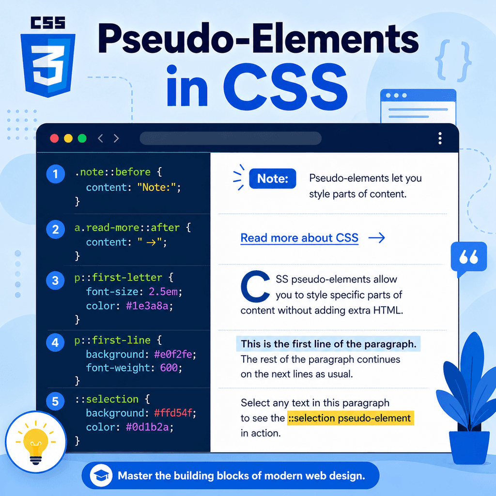
.note::before { content: “Note: “; font-weight: bold;}These are called pseudo-elements.
Pseudo-elements let CSS style parts of an element or create generated content without adding extra HTML elements.
The most common pseudo-elements include:
::before::after::first-line::first-letter::selectionThey are useful for decoration, small visual cues, typography, and improving the presentation of text.
What Is a Pseudo-Element?
A pseudo-element is a CSS selector that targets a specific part of an element.
It usually starts with two colons:
::For example:
p::first-letter { font-size: 2rem;}The pseudo-element is:
::first-letterThis selector means:
select the first letter of each paragraphThe pseudo-element is not written in the HTML.
The browser creates or identifies that part of the element for styling.
Pseudo-Elements vs Pseudo-Classes
Pseudo-elements and pseudo-classes are different.
A pseudo-class targets a state or condition:
a:hover { text-decoration: underline;}This styles a link when it is hovered.
A pseudo-element targets part of an element:
p::first-line { font-weight: bold;}This styles the first line of a paragraph.
A simple difference is:
pseudo-class = state or conditionpseudo-element = part of an elementPseudo-classes usually use one colon.
Pseudo-elements usually use two colons.
Why Pseudo-Elements Are Useful
Pseudo-elements are useful because they let you style or add small visual details without changing the HTML structure.
For example, instead of adding a decorative icon in the HTML:
<p><span>*</span> Important note</p>you can use CSS:
.note::before { content: “* “;}This keeps the HTML focused on meaning.
The CSS handles decoration.
Pseudo-elements can be used for:
decorative iconssmall labelsvisual separatorsfirst-letter stylingfirst-line stylingselected text stylingquotation marksbadgeslayout decorationThey are powerful, but they should be used carefully.
Important content should usually remain in the HTML.
The ::before Pseudo-Element
The ::before pseudo-element creates content before an element’s real content.
Example:
.note::before { content: “Note: “; font-weight: bold;}HTML:
<p class=”note”>Remember to save your CSS file.</p>The browser displays something like:
Note: Remember to save your CSS file.The text Note: is generated by CSS.
It does not appear in the HTML.
::before Needs the content Property
For ::before to appear, it usually needs the content property.
This will not show anything useful:
.note::before { font-weight: bold;}This works:
.note::before { content: “Note: “; font-weight: bold;}The content property tells the browser what the pseudo-element should contain.
For decorative pseudo-elements, an empty string is common:
.card::before { content: “”;}This creates an empty pseudo-element that can be styled as a shape, line, background, or decoration.
Using ::before for Decorative Labels
HTML:
<p class=”tip”>Use classes for reusable styles.</p>CSS:
.tip::before { content: “Tip: “; font-weight: bold; color: navy;}This adds Tip: before the paragraph text.
This can be useful when the label is decorative or repeated.
However, if the label is essential information, consider putting it in the HTML instead.
HTML is usually the right place for important content.
Using ::before for Decoration
You can also use ::before for purely visual decoration.
HTML:
<h2 class=”section-title”>CSS Selectors</h2>CSS:
.section-title::before { content: “”; display: inline-block; width: 8px; height: 8px; background-color: navy; margin-right: 8px;}This adds a small square before the heading.
The square is decoration.
It does not need to be part of the HTML.
This is a good use of a pseudo-element.
The ::after Pseudo-Element
The ::after pseudo-element creates content after an element’s real content.
Example:
.external-link::after { content: ” ↗”;}HTML:
<a class=”external-link” href=”https://example.com”>Visit Example</a>The browser displays something like:
Visit Example ↗The arrow is generated by CSS.
This can be useful for visual cues.
::after Example with Links
You can use ::after to mark links that open in a new tab.
HTML:
<a href=”https://example.com” target=”_blank”>External resource</a>CSS:
a[target=”_blank”]::after { content: ” ↗”;}This adds an arrow after links with target="_blank".
The selector uses an attribute selector and a pseudo-element together.
The attribute selector finds the links.
The pseudo-element adds the visual cue.
::before and ::after Are Inline by Default
Generated content from ::before and ::after is inline by default.
For example:
.note::before { content: “Note: “;}The generated text appears in the same line as the element’s content.
You can change the display type:
.card::before { content: “”; display: block; height: 4px; background-color: navy;}This creates a block-level decorative line before the card content.
The display property controls how the pseudo-element behaves.
Creating a Decorative Line with ::before
HTML:
<article class=”card”> <h2>CSS Basics</h2> <p>Learn how CSS styles web pages.</p></article>CSS:
.card::before { content: “”; display: block; height: 4px; background-color: navy; margin-bottom: 16px;}This adds a decorative line before the card content.
No extra HTML is needed.
This keeps the markup cleaner because the line is visual decoration, not meaningful page content.
Creating a Badge with ::after
HTML:
<h2 class=”lesson-title”>CSS Selectors</h2>CSS:
.lesson-title::after { content: ” New”; font-size: 0.75rem; font-weight: bold;}This adds the word New after the lesson title.
Be careful with this pattern.
If New is important information users need to understand the page, it may be better to include it in the HTML:
<h2>CSS Selectors <span>New</span></h2>Use CSS-generated content mainly for decoration or non-essential cues.
The content Property
The content property defines what ::before or ::after should generate.
Examples:
content: “”;content: “Tip: “;content: ” ↗”;An empty string creates a pseudo-element with no text content.
That is useful when creating shapes or decorative blocks.
Text content creates visible text.
The content property can also use more advanced values, but simple text and empty strings are enough for many common uses.
Important Content Should Usually Be in HTML
Generated content can be useful, but it has limits.
This may look convenient:
.button::after { content: “Submit application”;}But it is not a good way to provide important button text.
Better HTML:
<button type=”submit”>Submit application</button>Important text should usually be part of the HTML.
CSS should support presentation.
Do not rely on pseudo-elements as the only place where essential content exists.
The ::first-line Pseudo-Element
The ::first-line pseudo-element styles the first line of text inside an element.
Example:
p::first-line { font-weight: bold;}HTML:
<p> CSS controls the appearance of web pages. It can change colours, spacing, layout, fonts, and more.</p>The first visible line of the paragraph becomes bold.
The exact first line depends on the width of the container, the font size, and the viewport.
If the browser window changes size, the first line may change.
::first-line Depends on Layout
The first line is not necessarily the first sentence.
It is the first rendered line.
For example:
<p class=”intro”> CSS selectors tell the browser which elements to style and when to apply those styles.</p>CSS:
.intro::first-line { color: navy;}On a wide screen, the first line may contain many words.
On a narrow screen, it may contain fewer words.
The browser decides the first line after layout.
This makes ::first-line useful for typographic effects, but not for selecting a specific sentence.
Properties for ::first-line
Not every CSS property applies to ::first-line.
It is mainly used for text styling.
Common useful properties include:
colorfontfont-weightfont-styleletter-spacingword-spacingtext-decorationtext-transformline-heightbackgroundExample:
.intro::first-line { font-weight: bold; color: navy;}Use it for typographic emphasis.
Do not expect every layout property to work on ::first-line.
The ::first-letter Pseudo-Element
The ::first-letter pseudo-element styles the first letter of text inside an element.
Example:
p::first-letter { font-size: 2rem; font-weight: bold;}HTML:
<p>CSS makes web pages easier to design and customise.</p>The first letter C becomes larger and bold.
This can be used for drop-cap style effects.
Creating a Drop Cap with ::first-letter
A drop cap is a large first letter at the start of a paragraph.
HTML:
<p class=”article-intro”> CSS gives you control over the visual design of a web page.</p>CSS:
.article-intro::first-letter { font-size: 3rem; font-weight: bold; float: left; line-height: 1; margin-right: 8px;}This creates a large first letter that sits beside the first lines of text.
Use this sparingly.
It can be decorative, but it may not suit every design or reading context.
::first-letter Depends on Text Content
The first letter is based on the text content of the element.
Example:
<p>”CSS” stands for Cascading Style Sheets.</p>Depending on the browser and punctuation, the first styled part may include punctuation or the first actual letter.
This can vary in subtle ways.
For simple paragraphs that start with normal text, ::first-letter is straightforward.
For text starting with quotes, symbols, or inline elements, test the result.
The ::selection Pseudo-Element
The ::selection pseudo-element styles text selected by the user.
For example, when the user clicks and drags over text.
Example:
::selection { background-color: navy; color: white;}This changes the appearance of selected text.
You can apply it globally:
::selection { background-color: navy; color: white;}or only inside certain elements:
.article-content::selection { background-color: #eeeeee; color: #000000;}::selection Example
HTML:
<article class=”article-content”> <p>Select this text to see the custom selection style.</p></article>CSS:
.article-content::selection { background-color: #0055cc; color: white;}When the user selects text inside .article-content, the selected text uses the custom colours.
Keep selection colours readable.
The selected text should have enough contrast to remain easy to read.
Styling Generated Content
Generated content from ::before and ::after can be styled like normal inline or block content.
Example:
.warning::before { content: “!”; display: inline-block; width: 1.5rem; height: 1.5rem; text-align: center; font-weight: bold; margin-right: 0.5rem;}HTML:
<p class=”warning”>Check your form details before submitting.</p>This creates a small warning marker before the paragraph.
The marker is generated by CSS.
Positioning ::before and ::after
Pseudo-elements can be positioned.
Example:
<div class=”card”> <h2>Featured Lesson</h2> <p>Learn CSS selectors.</p></div>CSS:
.card { position: relative;} .card::after { content: “”; position: absolute; top: 12px; right: 12px; width: 12px; height: 12px; background-color: navy;}This adds a decorative square in the top-right corner of the card.
The .card is positioned relatively so the absolutely positioned pseudo-element is placed relative to the card.
Pseudo-Elements and Accessibility
Pseudo-elements can improve visual design, but they should not hide important information from the HTML.
Good use:
.external-link::after { content: ” ↗”;}This is a small visual cue.
Riskier use:
.required-field::after { content: “Required”;}If users need to know that a field is required, it is usually better to include that information clearly in the HTML and form attributes:
<label for=”email”>Email address <span>(required)</span></label><input type=”email” id=”email” required>CSS-generated content may not always be announced or understood consistently by assistive technologies.
Keep essential information in the HTML.
Pseudo-Elements and the DOM
Pseudo-elements are not normal HTML elements.
They do not appear as elements in your HTML source.
For example, this CSS:
.note::before { content: “Note: “;}does not insert this into your HTML file:
<span>Note: </span>The browser creates the pseudo-element for rendering.
Developer tools may show pseudo-elements in the page inspector, but they are still not real HTML elements you wrote.
This matters when thinking about structure, accessibility, and JavaScript.
Pseudo-Elements with Classes
Pseudo-elements are often combined with class selectors.
Example:
.card::before { content: “”; display: block; height: 4px; background-color: navy;}HTML:
<article class=”card”> <h2>Card Title</h2> <p>Card text.</p></article>Only elements with class="card" receive the pseudo-element.
This is a common and useful pattern.
The class identifies the component.
The pseudo-element adds decoration.
Pseudo-Elements with Attribute Selectors
You can combine pseudo-elements with attribute selectors.
Example:
a[target=”_blank”]::after { content: ” ↗”;}HTML:
<a href=”https://example.com” target=”_blank”>External site</a>This adds an arrow after links that open in a new tab.
Another example:
a[href$=”.pdf”]::after { content: ” PDF”;}This adds a text cue after links ending in .pdf.
Again, use generated content carefully.
For essential information, HTML may be more reliable.
Pseudo-Elements with Pseudo-Classes
You can combine pseudo-elements with pseudo-classes.
Example:
a:hover::after { content: ” →”;}This shows an arrow after a link when it is hovered.
Another example:
button:focus-visible::after { content: ” ✓”;}This shows generated content when a button has visible focus.
Use these patterns sparingly.
Changing content during interaction can be distracting if overused.
Single Colon vs Double Colon
Modern CSS uses double colons for pseudo-elements:
p::first-line { font-weight: bold;}Older CSS examples may use a single colon:
p:first-line { font-weight: bold;}Many browsers still support single-colon syntax for older pseudo-elements for compatibility.
However, the modern convention is to use double colons for pseudo-elements:
::before::after::first-line::first-letter::selectionUse double colons in new CSS.
A Complete Example
HTML:
<!DOCTYPE html><html lang=”en”><head> <meta charset=”UTF-8″> <title>Pseudo-Elements Example</title> <link rel=”stylesheet” href=”styles.css”></head><body> <main class=”container”> <article class=”article-content”> <h1 class=”article-title”>Pseudo-Elements in CSS</h1> <p class=”intro”> CSS pseudo-elements let you style specific parts of an element and add decorative generated content. </p> <p class=”note”> Use pseudo-elements for presentation, not as the only place for important content. </p> <a href=”https://example.com” target=”_blank”>External resource</a> </article> <section class=”card”> <h2>Featured Lesson</h2> <p>Learn how generated content works.</p> </section> </main> </body></html>CSS:
body { font-family: Arial, sans-serif; line-height: 1.6;} .container { width: 90%; max-width: 900px; margin: 0 auto;} .article-title::after { content: “”; display: block; width: 80px; height: 4px; background-color: navy; margin-top: 12px;} .intro::first-line { font-weight: bold; color: navy;} .intro::first-letter { font-size: 2.5rem; font-weight: bold;} .note::before { content: “Note: “; font-weight: bold;} a[target=”_blank”]::after { content: ” ↗”;} .card { position: relative; padding: 24px; border: 1px solid #dddddd;} .card::before { content: “”; display: block; height: 4px; background-color: navy; margin-bottom: 16px;} ::selection { background-color: navy; color: white;}This example uses ::after, ::first-line, ::first-letter, ::before, and ::selection.
How the Complete Example Works
This rule creates a decorative line after the article title:
.article-title::after { content: “”; display: block; width: 80px; height: 4px;}This rule styles the first line of the intro paragraph:
.intro::first-line { font-weight: bold;}This rule styles the first letter of the intro paragraph:
.intro::first-letter { font-size: 2.5rem;}This rule adds a generated label before the note:
.note::before { content: “Note: “;}This rule adds an arrow after links that open in a new tab:
a[target=”_blank”]::after { content: ” ↗”;}This rule changes the style of selected text:
::selection { background-color: navy; color: white;}Each pseudo-element targets a specific part of the rendered page.
Common Mistake: Forgetting content with ::before and ::after
This usually will not show anything:
.note::before { color: navy;}This works:
.note::before { content: “Note: “; color: navy;}For ::before and ::after, remember to include content.
Even decorative pseudo-elements usually need:
content: “”;Common Mistake: Using Pseudo-Elements for Essential Content
Less suitable:
.price::after { content: ” including VAT”;}If the VAT information is important, put it in the HTML:
<p class=”price”>£20 <span>including VAT</span></p>Generated content can be useful for visual cues, but important information should usually be written in the HTML.
Common Mistake: Confusing Pseudo-Classes and Pseudo-Elements
Pseudo-class:
a:hover { color: blue;}Pseudo-element:
p::first-line { color: blue;}:hover is a state.
::first-line is part of an element.
Use one colon for pseudo-classes.
Use two colons for pseudo-elements.
Common Mistake: Expecting ::first-line to Mean First Sentence
This styles the first rendered line:
p::first-line { font-weight: bold;}It does not necessarily style the first sentence.
The first line changes depending on:
container widthfont sizeviewport sizeline breakstext lengthUse ::first-line for visual typography, not for selecting a fixed piece of text.
Common Mistake: Overusing Decorative Pseudo-Elements
Pseudo-elements can make designs more polished, but too many decorative additions can clutter the page.
For example:
h2::before { content: “★ “;} h2::after { content: ” ★”;} a::after { content: ” →”;} p::before { content: “• “;}This may become visually noisy.
Use pseudo-elements where they support the design.
Avoid adding decoration to everything.
Common Mistake: Not Testing Selection Colours
This can look good in theory:
::selection { background-color: yellow; color: white;}But white text on yellow can be hard to read.
Selection styles should have enough contrast.
Always test selected text to make sure it remains readable.
Common Mistake: Forgetting Pseudo-Elements Are Not Real HTML Elements
Pseudo-elements are rendered by the browser, but they are not normal HTML elements in your source.
You cannot rely on them in the same way as real HTML content.
If content needs to be copied, translated, indexed, announced, submitted, or understood as part of the document, it usually belongs in HTML.
Use pseudo-elements for presentation and decoration.
Best Practices
Use double colons for pseudo-elements.
Use ::before and ::after for decorative generated content.
Include the content property with ::before and ::after.
Use content: "" for decorative shapes or lines.
Keep important content in HTML.
Use ::first-line for typographic first-line styling.
Use ::first-letter for drop caps or first-letter emphasis.
Use ::selection to customise selected text carefully.
Check that selection colours are readable.
Avoid overusing decorative pseudo-elements.
Use browser developer tools to inspect generated pseudo-elements.
Summary
Pseudo-elements let CSS style specific parts of an element or add generated content.
They usually use double colons:
selector::pseudo-element { property: value;}The ::before pseudo-element adds generated content before an element’s content:
.note::before { content: “Note: “;}The ::after pseudo-element adds generated content after an element’s content:
a[target=”_blank”]::after { content: ” ↗”;}The ::first-line pseudo-element styles the first rendered line:
p::first-line { font-weight: bold;}The ::first-letter pseudo-element styles the first letter:
p::first-letter { font-size: 2rem;}The ::selection pseudo-element styles selected text:
::selection { background-color: navy; color: white;}The main idea is simple:
Pseudo-elements let CSS style parts of elements and add presentational content.Used carefully, pseudo-elements help you create cleaner HTML and more flexible visual design.