
Introduction
CSS selectors can target elements by tag name, class, ID, attribute, and position in the HTML structure.
Pseudo-classes add another useful option.
A pseudo-class lets you style an element when it is in a particular state or when it has a particular relationship in the document.
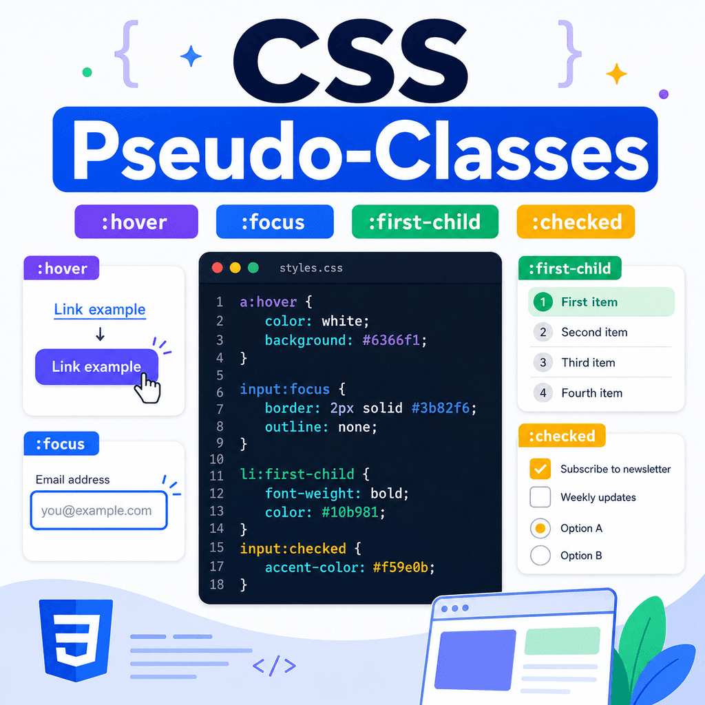
For example, a link can change when a user hovers over it:
a:hover { text-decoration: underline;}A form field can change when it receives focus:
input:focus { outline: 2px solid #0055cc;}A list item can be styled if it is the first child:
li:first-child { font-weight: bold;}A checkbox can affect styling when it is checked:
input:checked { outline: 2px solid green;}Pseudo-classes are useful because they let CSS respond to interaction, form state, and document structure without needing extra classes for every situation.
What Is a Pseudo-Class?
A pseudo-class is a keyword added to a selector.
It starts with a colon:
:For example:
button:hover { background-color: #eeeeee;}The pseudo-class is:
:hoverThis selector means:
select a button when the user is hovering over itPseudo-classes do not usually appear in the HTML.
You do not write:
<button class=”:hover”>Save</button>The browser applies pseudo-classes when the matching state or condition is true.
Why Pseudo-Classes Are Useful
Pseudo-classes help you style elements based on conditions.
They can respond to:
mouse interactionkeyboard focusform control statelink historyelement positiondocument structurevalidation stateenabled or disabled stateFor example, CSS can style a button when a pointer is over it:
button:hover { background-color: #f0f0f0;}CSS can style an input when a user is typing in it:
input:focus { border-color: #0055cc;}CSS can style the first list item:
li:first-child { font-weight: bold;}These are all conditions that CSS can detect through pseudo-classes.
Pseudo-Class Syntax
The basic syntax is:
selector:pseudo-class { property: value;}For example:
a:hover { color: darkblue;}The selector is:
aThe pseudo-class is:
:hoverThe declaration is:
color: darkblue;Together, this means:
when a link is hovered, make its text dark bluePseudo-Classes Are Different from Classes
A normal class is written in HTML:
<p class=”intro”>Welcome to the page.</p>CSS selects it with a dot:
.intro { font-size: 1.2rem;}A pseudo-class is not written as an HTML class.
It is written in CSS with a colon:
a:hover { text-decoration: underline;}The browser decides when :hover applies.
A class describes something you add to the HTML.
A pseudo-class describes a state or condition the browser can detect.
The :hover Pseudo-Class
The :hover pseudo-class applies when the user points at an element with a mouse, trackpad, stylus, or similar pointer.
Example:
a:hover { text-decoration: underline;}This underlines a link when it is hovered.
Another example:
button:hover { background-color: #eeeeee;}This changes a button background when it is hovered.
Hover styles can make a page feel more interactive.
However, do not rely on hover alone because touchscreens and keyboard users may not experience hover in the same way.
:hover Example
HTML:
<a href=”about.html”>About us</a> <button type=”button”>Save</button>CSS:
a:hover { color: darkblue;} button:hover { background-color: #f5f5f5;}When the user points at the link, the link colour changes.
When the user points at the button, the button background changes.
The HTML does not need to change.
The browser applies the :hover pseudo-class when the hover state is active.
The :focus Pseudo-Class
The :focus pseudo-class applies when an element receives focus.
Focus often happens when a user clicks into a form field or uses the keyboard to tab to a link, button, or input.
Example:
input:focus { outline: 2px solid #0055cc;}This styles an input when it has focus.
Another example:
a:focus { outline: 2px solid #0055cc;}This styles a link when it receives focus.
Focus styles are important for accessibility.
They help keyboard users see where they are on the page.
:focus Example
HTML:
<label for=”email”>Email address</label><input type=”email” id=”email” name=”email”> <button type=”submit”>Subscribe</button>CSS:
input:focus,button:focus { outline: 2px solid #0055cc; outline-offset: 2px;}When the input or button receives focus, the outline appears.
This is useful for users who navigate with the keyboard.
Do not remove focus outlines unless you replace them with a clear alternative.
:focus-visible
The :focus-visible pseudo-class is similar to :focus, but it is designed to show focus styles when they are most useful, such as during keyboard navigation.
Example:
a:focus-visible,button:focus-visible,input:focus-visible { outline: 2px solid #0055cc; outline-offset: 2px;}This can avoid showing a focus outline in some mouse-click situations while still preserving keyboard focus visibility.
For many projects, :focus-visible is a good choice for visible focus indicators.
If you use it, test keyboard navigation to make sure focus is still clear.
:hover and :focus Together
Interactive elements should often have both hover and focus styles.
Less complete:
a:hover { text-decoration: underline;}Better:
a:hover,a:focus-visible { text-decoration: underline;}This gives a similar visual cue to mouse users and keyboard users.
Another example:
button:hover,button:focus-visible { background-color: #eeeeee;}Do not design only for pointer interaction.
Keyboard focus needs clear styling too.
The :active Pseudo-Class
The :active pseudo-class applies while an element is being activated.
For example, when a user presses a mouse button down on a link or button.
Example:
button:active { transform: translateY(1px);}This can make a button feel pressed.
Another example:
a:active { color: darkred;}The active state is usually brief.
It is useful for small interaction feedback.
Link Pseudo-Classes
Links have special pseudo-classes.
Common link states include:
a:linka:visiteda:hovera:focusa:active:link applies to links that have not been visited.
:visited applies to links the browser considers visited.
:hover applies when the link is hovered.
:focus applies when the link has focus.
:active applies while the link is being activated.
Styling Link States
Example:
a:link { color: #0055cc;} a:visited { color: #663399;} a:hover,a:focus-visible { text-decoration: underline;} a:active { color: #cc0000;}This gives links different visual states.
Modern browsers restrict which properties can be applied to :visited for privacy reasons.
For basic styling, changing visited link colour is common.
The main point is that links can have several states, not only hover.
The :first-child Pseudo-Class
The :first-child pseudo-class selects an element if it is the first child of its parent.
Example:
li:first-child { font-weight: bold;}HTML:
<ul> <li>First item</li> <li>Second item</li> <li>Third item</li></ul>This selects the first <li> because it is the first child of the <ul>.
It does not select the second or third item.
:first-child Depends on the Parent
The element must be the first child of its parent.
Example:
<section> <h2>Topics</h2> <p>First paragraph.</p> <p>Second paragraph.</p></section>CSS:
p:first-child { font-weight: bold;}This does not select the first paragraph because the first child of the section is the <h2>, not the <p>.
If you want the first paragraph of its type, you may need another pseudo-class such as :first-of-type.
The :last-child Pseudo-Class
The :last-child pseudo-class selects an element if it is the last child of its parent.
Example:
li:last-child { margin-bottom: 0;}HTML:
<ul> <li>First item</li> <li>Second item</li> <li>Third item</li></ul>This selects the third <li> because it is the last child of the <ul>.
This is useful when removing extra spacing from the last item in a list or component.
The :first-of-type Pseudo-Class
The :first-of-type pseudo-class selects the first element of a specific type among its siblings.
Example:
p:first-of-type { font-weight: bold;}HTML:
<section> <h2>Topics</h2> <p>First paragraph.</p> <p>Second paragraph.</p></section>This selects the first paragraph.
Unlike p:first-child, it does not require the paragraph to be the first child overall.
It only needs to be the first <p> among its siblings.
The :nth-child() Pseudo-Class
The :nth-child() pseudo-class selects elements based on their position among siblings.
Example:
li:nth-child(2) { font-weight: bold;}This selects the second list item.
HTML:
<ul> <li>First item</li> <li>Second item</li> <li>Third item</li></ul>You can also use keywords:
li:nth-child(odd) { background-color: #f5f5f5;}li:nth-child(even) { background-color: #ffffff;}This is useful for alternating table rows or list items.
The :checked Pseudo-Class
The :checked pseudo-class applies to checkboxes, radio buttons, and some options when they are selected.
Example:
input:checked { outline: 2px solid green;}HTML:
<label> <input type=”checkbox” name=”updates”> Send me updates</label>When the checkbox is checked, the input matches :checked.
This is useful for styling selected form controls.
Styling Checked Checkboxes
You can combine :checked with sibling selectors.
HTML:
<label class=”choice”> <input type=”checkbox” name=”topic” value=”css”> <span>CSS tutorials</span></label>CSS:
.choice input:checked + span { font-weight: bold;}This means:
inside .choice, when the input is checked, style the span immediately after itThe text becomes bold when the checkbox is checked.
This works because the <span> comes immediately after the input.
Styling Checked Radio Buttons
Radio buttons can also use :checked.
HTML:
<label class=”option”> <input type=”radio” name=”level” value=”basic”> <span>Basic</span></label> <label class=”option”> <input type=”radio” name=”level” value=”advanced”> <span>Advanced</span></label>CSS:
.option input:checked + span { color: navy; font-weight: bold;}When a radio button is selected, the label text after it is styled.
This gives users a clearer visual cue about the selected option.
The :disabled Pseudo-Class
The :disabled pseudo-class selects disabled form controls.
HTML:
<input type=”text” disabled><button type=”submit” disabled>Submit</button>CSS:
input:disabled,button:disabled { opacity: 0.6; cursor: not-allowed;}This styles disabled controls differently.
Disabled controls cannot usually be edited, focused, or submitted.
They should look unavailable but still readable.
The :enabled Pseudo-Class
The :enabled pseudo-class selects form controls that are enabled.
Example:
button:enabled { cursor: pointer;}This applies only to buttons that can be used.
You can combine enabled and disabled styles:
button:enabled { cursor: pointer;} button:disabled { opacity: 0.6; cursor: not-allowed;}This helps users understand which controls are available.
The :required Pseudo-Class
The :required pseudo-class selects form controls with the required attribute.
HTML:
<input type=”email” required>CSS:
input:required { border-left: 4px solid navy;}This selects required inputs.
There is also :optional, which selects form controls that are not required.
These pseudo-classes can help style forms based on validation requirements.
The :valid and :invalid Pseudo-Classes
Form controls can also match validation states.
Example:
input:valid { border-color: green;} input:invalid { border-color: red;}HTML:
<input type=”email” required>If the input contains a valid email address, it may match :valid.
If it is empty or contains invalid email text, it may match :invalid.
Be careful with :invalid, because required empty fields may appear invalid before the user has interacted with them.
That can feel harsh if the form shows errors too early.
A Practical Form Example
HTML:
<form class=”signup-form”> <label for=”email”>Email address</label> <input type=”email” id=”email” name=”email” required> <label class=”choice”> <input type=”checkbox” name=”updates”> <span>Send me updates</span> </label> <button type=”submit”>Subscribe</button></form>CSS:
.signup-form input:focus { outline: 2px solid #0055cc; outline-offset: 2px;} .signup-form input:required { border-left: 4px solid navy;} .choice input:checked + span { font-weight: bold;} .signup-form button:hover,.signup-form button:focus-visible { background-color: #eeeeee;}This uses pseudo-classes for focus, required fields, checked checkboxes, and button interaction.
A Practical Navigation Example
HTML:
<nav class=”site-nav”> <a href=”index.html”>Home</a> <a href=”lessons.html”>Lessons</a> <a href=”contact.html”>Contact</a></nav>CSS:
.site-nav a { text-decoration: none;} .site-nav a:hover,.site-nav a:focus-visible { text-decoration: underline;} .site-nav a:active { color: darkred;}This styles navigation links in different interaction states.
The hover and focus-visible states help users see which link they are interacting with.
A Practical List Example
HTML:
<ul class=”lesson-list”> <li>Selectors</li> <li>Properties</li> <li>Values</li> <li>The cascade</li></ul>CSS:
.lesson-list li:first-child { font-weight: bold;} .lesson-list li:last-child { margin-bottom: 0;} .lesson-list li:nth-child(odd) { background-color: #f5f5f5;}This styles the first item, removes spacing from the last item, and gives odd items a background.
Pseudo-classes are useful for list styling because they can target position without extra classes.
Combining Pseudo-Classes
You can combine pseudo-classes.
Example:
button:hover:enabled { background-color: #eeeeee;}This selects buttons that are both hovered and enabled.
It does not apply to disabled buttons.
Another example:
input:required:focus { border-color: navy;}This selects a required input while it has focus.
Combining pseudo-classes can be useful, but keep selectors readable.
Combining Pseudo-Classes with Classes
Pseudo-classes are often combined with class selectors.
Example:
.button:hover { background-color: #eeeeee;}This targets elements with class="button" when they are hovered.
Another example:
.card:first-child { border-top: 4px solid navy;}This selects a .card element if it is the first child of its parent.
Classes define the component.
Pseudo-classes define the state or condition.
Pseudo-Classes and Specificity
A pseudo-class has similar specificity to a class selector.
For example:
button:hover { background-color: #eeeeee;}has more specificity than:
button { background-color: white;}If both rules apply during hover, the hover rule can override the normal button rule.
This is one reason pseudo-class styles often work well as state styles.
Pseudo-Classes Are Not Pseudo-Elements
Pseudo-classes and pseudo-elements are different.
A pseudo-class uses one colon and selects a state or condition:
a:hover { color: blue;}A pseudo-element usually uses two colons and styles part of an element:
p::first-line { font-weight: bold;}This article focuses on pseudo-classes such as :hover, :focus, :first-child, and :checked.
Pseudo-elements are a separate topic.
A Complete Example
HTML:
<!DOCTYPE html><html lang=”en”><head> <meta charset=”UTF-8″> <title>CSS Pseudo-Classes Example</title> <link rel=”stylesheet” href=”styles.css”></head><body> <main class=”container”> <h1>CSS Pseudo-Classes</h1> <nav class=”site-nav”> <a href=”index.html”>Home</a> <a href=”lessons.html”>Lessons</a> <a href=”contact.html”>Contact</a> </nav> <section class=”card”> <h2>Lesson Topics</h2> <ul class=”lesson-list”> <li>Hover states</li> <li>Focus states</li> <li>First child selectors</li> <li>Checked form controls</li> </ul> </section> <form class=”signup-form”> <label for=”email”>Email address</label> <input type=”email” id=”email” name=”email” required> <label class=”choice”> <input type=”checkbox” name=”updates”> <span>Send me CSS updates</span> </label> <button type=”submit”>Subscribe</button> </form> </main> </body></html>CSS:
body { font-family: Arial, sans-serif; line-height: 1.6;} .container { width: 90%; max-width: 900px; margin: 0 auto;} .site-nav a { text-decoration: none;} .site-nav a:hover,.site-nav a:focus-visible { text-decoration: underline;} .card { padding: 24px; border: 1px solid #dddddd;} .lesson-list li:first-child { font-weight: bold;} .lesson-list li:nth-child(odd) { background-color: #f5f5f5;} .signup-form input:focus-visible,.signup-form button:focus-visible { outline: 2px solid #0055cc; outline-offset: 2px;} .signup-form input:required { border-left: 4px solid navy;} .choice input:checked + span { font-weight: bold;} .signup-form button:hover,.signup-form button:focus-visible { background-color: #eeeeee;}This example uses pseudo-classes for links, lists, forms, checkboxes, and buttons.
How the Complete Example Works
This rule styles navigation links when hovered or focused:
.site-nav a:hover,.site-nav a:focus-visible { text-decoration: underline;}This rule styles the first list item:
.lesson-list li:first-child { font-weight: bold;}This rule styles odd list items:
.lesson-list li:nth-child(odd) { background-color: #f5f5f5;}This rule styles focused form controls:
.signup-form input:focus-visible,.signup-form button:focus-visible { outline: 2px solid #0055cc;}This rule styles required inputs:
.signup-form input:required { border-left: 4px solid navy;}This rule styles checkbox text when the checkbox is checked:
.choice input:checked + span { font-weight: bold;}Each pseudo-class applies only when its condition is true.
Common Mistake: Removing Focus Styles
Avoid this:
button:focus { outline: none;}This can make keyboard navigation difficult.
Better:
button:focus-visible { outline: 2px solid #0055cc; outline-offset: 2px;}Focus styles help users know which element is active.
Do not remove them unless you provide a clear replacement.
Common Mistake: Using Hover Without Focus
Less complete:
a:hover { text-decoration: underline;}Better:
a:hover,a:focus-visible { text-decoration: underline;}Mouse users get hover feedback.
Keyboard users get focus feedback.
Interactive states should consider more than one input method.
Common Mistake: Confusing :first-child and :first-of-type
HTML:
<section> <h2>Heading</h2> <p>First paragraph.</p></section>This does not match the paragraph:
p:first-child { font-weight: bold;}because the paragraph is not the first child of the section.
This does match:
p:first-of-type { font-weight: bold;}because it is the first paragraph of its type.
Use the pseudo-class that matches the structure you actually need.
Common Mistake: Expecting :checked to Style Any Nearby Element
HTML:
<label class=”choice”> <input type=”checkbox”> <span>Subscribe</span></label>This works:
.choice input:checked + span { font-weight: bold;}because the <span> immediately follows the input.
If the HTML changes to:
<label class=”choice”> <span>Subscribe</span> <input type=”checkbox”></label>the same selector no longer works because the span does not come after the input.
The + selector depends on element order.
Common Mistake: Styling Invalid Fields Too Early
This can show an error style immediately:
input:invalid { border-color: red;}If the input is required and empty, it may appear invalid before the user has typed anything.
That can feel aggressive.
A more careful approach is to combine validation styling with other states or JavaScript-enhanced classes later.
For simple CSS-only examples, use invalid styling carefully and test how it feels in the form.
Common Mistake: Thinking Pseudo-Classes Are Written in HTML
Incorrect:
<a class=”:hover” href=”about.html”>About</a>Correct CSS:
a:hover { text-decoration: underline;}Pseudo-classes belong in CSS selectors.
They are not class names written in the HTML.
Best Practices
Use :hover for pointer interaction.
Pair hover styles with :focus-visible where appropriate.
Keep focus indicators visible.
Use :first-child, :last-child, and :nth-child() for structural styling.
Use :first-of-type when you need the first element of a specific type.
Use :checked for selected checkboxes and radio buttons.
Use :disabled and :enabled to style unavailable and available controls.
Use :required, :valid, and :invalid carefully in forms.
Remember that pseudo-classes start with a colon.
Remember that pseudo-classes describe a state or condition, not an HTML class.
Use browser developer tools to force states such as hover and focus when testing.
Summary
CSS pseudo-classes style elements when a state or condition is true.
They start with a colon:
selector:pseudo-class { property: value;}Examples include:
a:hover { text-decoration: underline;}input:focus { outline: 2px solid #0055cc;}li:first-child { font-weight: bold;}input:checked { outline: 2px solid green;}Pseudo-classes can respond to interaction, focus, form state, validation, and element position.
The main idea is simple:
Pseudo-classes let CSS style elements based on states and conditions.Used well, they make pages more interactive, more readable, and easier to use.