
Introduction
Website performance matters because people notice slow, unstable, and awkward pages.
If a page takes too long to load, buttons feel delayed, or content jumps around while someone is trying to read, the website feels less reliable. That affects user experience before anyone thinks about SEO.
Core Web Vitals and page experience are useful because they turn vague complaints like “the site feels slow” into measurable issues: loading performance, interaction responsiveness, and visual stability.
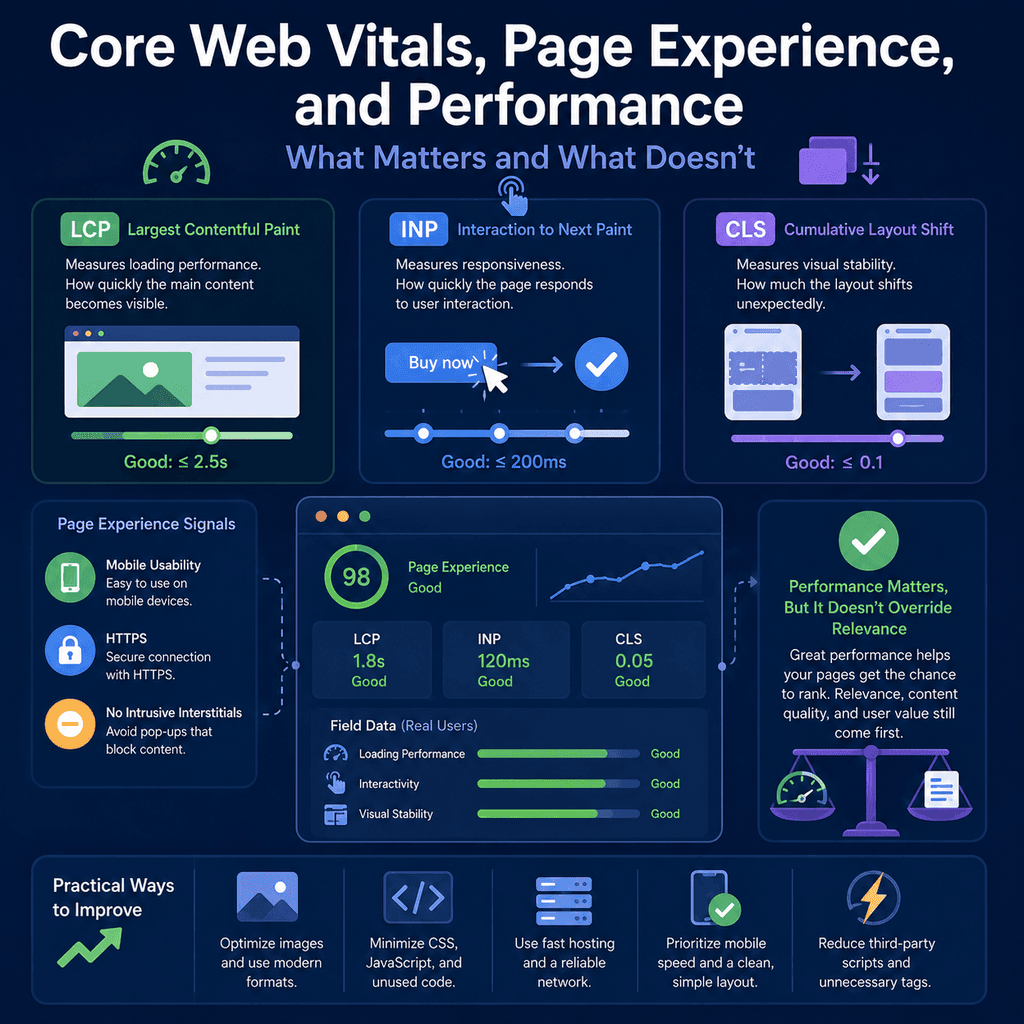
However, performance is not a magic ranking shortcut. A fast page with weak, irrelevant, or unhelpful content is still a weak page. A polished speed score does not override search intent, relevance, trust, or content quality.
This guide explains what Core Web Vitals and page experience mean in plain English, what matters for small business websites, what does not matter as much as people think, and how to make sensible performance decisions during a website build, redesign, or SEO review.
Introduction
Core Web Vitals are a set of user experience metrics focused on three practical questions.
- Does the main content load quickly?
- Does the page respond promptly when someone interacts with it?
- Does the layout stay stable while the page loads?
The current Core Web Vitals are Largest Contentful Paint, Interaction to Next Paint, and Cumulative Layout Shift. Google’s Core Web Vitals documentation describes them as measures of real-world user experience for loading performance, interactivity, and visual stability.
Page experience is broader than Core Web Vitals alone. Google’s page experience guidance discusses Core Web Vitals alongside other user-facing issues such as secure pages, mobile display, intrusive interstitials, distracting ads, and whether the main content is easy to access and distinguish.
For a small business website, the practical aim is not to chase perfect scores for their own sake. The aim is to build pages that load reliably, work well on phones, respond when people tap, remain visually stable, avoid unnecessary interruptions, and still provide useful content that matches what the visitor needs.
The Plain-English Version
Core Web Vitals can sound technical, but the user-facing meaning is straightforward.
- LCP is about loading: how long it takes before the main visible content appears.
- INP is about responsiveness: how quickly the page reacts after a user clicks, taps, or types.
- CLS is about stability: whether content unexpectedly moves around while the page is loading or being used.
These three metrics do not measure everything about a website. They do not judge whether your service page is persuasive, whether your pricing is clear, whether your contact details are easy to find, whether your content answers the searcher’s question, or whether your business is trustworthy.
They measure specific parts of the page experience that can be tested and improved.
That distinction matters. Core Web Vitals are useful indicators, not a complete definition of website quality.
Performance Matters, But It Does Not Replace Relevance
One of the most important points is also one of the easiest to misunderstand: performance supports search success, but it does not replace relevance or content quality.
Google’s page experience guidance explains that page experience can align with what Google’s ranking systems seek to reward, but it also makes clear that good page experience does not guarantee top rankings. Google Search still seeks to show helpful, reliable, relevant content.
For website owners, this means performance should be treated as part of the foundation, not as a replacement for useful content.
A slow page can frustrate users and reduce the value of a good result. But a fast page that does not answer the searcher’s question is still unlikely to be the best result. The best outcome is a page that is relevant, useful, trustworthy, and technically comfortable to use.
What Core Web Vitals Measure
Google and web.dev define recommended targets for each Core Web Vital. The commonly used thresholds are:
| Metric | Plain-English meaning | Good threshold |
|---|---|---|
| Largest Contentful Paint | How quickly the main visible content appears. | 2.5 seconds or less. |
| Interaction to Next Paint | How quickly the page responds after a user interaction. | 200 milliseconds or less. |
| Cumulative Layout Shift | Whether visible content unexpectedly moves around. | 0.1 or less. |
These metrics are usually assessed using the 75th percentile of page loads, segmented across mobile and desktop devices. In plain English, the question is not “did the page perform well once on a fast laptop?” The question is closer to “do most real users get a good experience, including users on less ideal devices and connections?”
PageSpeed Insights explains that its field data uses real-user experience data from the Chrome User Experience Report where enough data is available, and that the 75th percentile is used to understand the more frustrating experiences users may have. Its lab data comes from Lighthouse in a controlled test environment. This is why field and lab results can differ. See Google’s PageSpeed Insights documentation for the distinction between real-user data and lab diagnostics.
Largest Contentful Paint: Loading Performance
Largest Contentful Paint, usually shortened to LCP, measures how long it takes for the largest relevant content element in the visible part of the page to render.
On a typical local service page, the LCP element might be a large hero image, a prominent heading block, a banner image, or a large section of text. On a product page, it might be the main product image. On an article, it might be the article heading or featured image area.
The web.dev guide to Largest Contentful Paint explains that LCP is intended to measure perceived loading speed because it marks the point when the page’s main content has likely loaded.
LCP matters because it reflects when the page starts to feel useful. A page can technically begin loading, but if the main content is still missing, the user is still waiting.
What Poor LCP Feels Like
Poor LCP often feels like a page that hesitates before showing anything useful.
The visitor may see a blank area, a spinner, a delayed hero image, or a layout shell with no meaningful content. On a mobile connection, the delay can be more obvious because images, scripts, fonts, and third-party resources may take longer to arrive.
For a business website, this can affect trust. If the homepage, main service page, product category, booking page, or contact page is slow to show its main content, the business may feel less professional even if the content eventually appears.
Common Causes of Poor LCP
LCP problems often come from a small number of practical issues.
- Large uncompressed hero images.
- Images served at much larger dimensions than needed.
- Slow hosting or slow server response.
- Too many blocking scripts before the main content can appear.
- Heavy themes, templates, or page builders loading unnecessary assets.
- Fonts that delay visible text.
- Important content loaded late through client-side JavaScript.
- Large sliders, background videos, maps, or widgets placed before the main content.
For many small business websites, images are a frequent problem. A visually attractive hero image can still be poorly prepared for the web if it is too large, in the wrong format, or loaded without the right priority when it is the main visible content.
Practical Ways to Improve LCP
Improving LCP usually means helping the main content appear sooner. The web.dev guide to optimising LCP focuses on improving the load time of the LCP resource, reducing delays before the browser starts loading it, and avoiding unnecessary rendering delays.
Practical improvements often include:
- Compressing large images before upload.
- Using appropriate image dimensions rather than uploading oversized originals.
- Using modern image formats where appropriate.
- Making sure the main heading and key text are not delayed behind unnecessary scripts.
- Reducing render-blocking CSS and JavaScript where possible.
- Choosing hosting that responds quickly enough for the site’s needs.
- Avoiding large sliders, videos, animations, or third-party widgets above the fold unless they are genuinely necessary.
- Testing the actual page templates that matter, not only the homepage.
For many brochure, clinic, trade, hospitality, and local service websites, the biggest win is not exotic engineering. It is often disciplined image handling, simpler templates, fewer unnecessary scripts, and a clear priority for showing the main content quickly.
Here is a useful deep dive YouTube video by Google about optimizing LCP.
Interaction to Next Paint: Responsiveness
Interaction to Next Paint, usually shortened to INP, measures how responsive a page is when someone interacts with it.
Interactions include actions such as clicking a button, tapping a menu, choosing an option, or typing into a field. INP looks at the time between the user’s interaction and the next visible response from the page.
The web.dev guide to Interaction to Next Paint explains INP as a responsiveness metric that observes interactions throughout the page lifecycle.
In plain English, INP asks: when the user does something, does the page feel responsive?
What Poor INP Feels Like
Poor INP feels like a page that ignores the user for a moment.
A visitor taps a mobile menu and nothing seems to happen. They click a form button and the page appears frozen. They try to type into a field and the text lags. They open a product filter or booking dropdown and the interface responds slowly.
This kind of delay creates uncertainty. The user may wonder whether the tap worked, whether the form submitted, or whether the website is broken.
For small business sites, INP problems are especially important on menus, booking forms, contact forms, quote forms, product filters, checkout steps, and any page where a user is close to taking action.
Common Causes of Poor INP
INP problems are often linked to heavy JavaScript and busy main-thread work in the browser.
- Large JavaScript bundles.
- Too many third-party scripts.
- Complex menus, sliders, filters, maps, or animations.
- Tracking tags and embeds competing for browser resources.
- Forms or interactive elements that trigger heavy processing.
- Client-side code that delays feedback after a click or tap.
- Plugins that load functionality site-wide even when it is only needed on one page.
This is especially relevant on mobile devices. A fast desktop computer may hide problems that become obvious on a lower-powered phone.
Practical Ways to Improve INP
Improving INP usually means reducing unnecessary browser work and making important interactions simpler. The web.dev guide to optimising INP explains that responsiveness can be improved by reducing long tasks, minimising unnecessary JavaScript work, and ensuring interactions receive quick feedback.
Practical improvements often include:
- Removing scripts that are not needed.
- Auditing tracking tags, chat widgets, popups, sliders, heatmaps, and embeds.
- Keeping mobile menus simple and fast.
- Avoiding basic navigation that depends on heavy scripts.
- Breaking up expensive JavaScript tasks where development work is needed.
- Providing immediate visual feedback when a button, form, or menu is used.
- Testing important interactions on real mobile devices, not only on a developer’s laptop.
For small business sites, the practical question is often not “can we add another plugin?” It is “does this script, widget, popup, animation, or embed add enough user value to justify its performance cost?”
Cumulative Layout Shift: Visual Stability
Cumulative Layout Shift, usually shortened to CLS, measures unexpected layout movement.
A layout shift happens when visible content moves from one position to another after it has already appeared. Some movement is expected, such as a menu opening after a user taps it. CLS is mainly concerned with unexpected movement that happens without the user asking for it.
The web.dev guide to Cumulative Layout Shift explains that CLS measures visual stability and helps quantify how often users experience unexpected layout shifts.
In plain English, CLS asks: does the page stay still while the user is trying to read or interact with it?
What Poor CLS Feels Like
Poor CLS feels irritating because it breaks the user’s focus.
A visitor starts reading and the text jumps down because an image loads above it. They are about to tap a button, but a cookie banner, advert, or embedded widget appears and moves the button away. They tap the wrong thing because the page changed at the last moment.
This is not just a technical issue. It is a trust and usability issue. A jumpy page feels careless, and it can make forms, contact buttons, product pages, booking pages, and checkout steps harder to use.
Common Causes of Poor CLS
CLS problems often come from elements that load without reserved space.
- Images without width and height information.
- Embedded videos, maps, reviews, social widgets, or booking widgets that load late.
- Ads or banners inserted above existing content.
- Cookie notices or promotional bars that push content down unexpectedly.
- Fonts that swap in and change text dimensions.
- Late-loading forms or call-to-action blocks.
- Product images, review widgets, or stock-status blocks that change size after loading.
Many CLS issues can be prevented during design and development by reserving space for content before it loads.
Practical Ways to Improve CLS
Improving CLS usually means making page layout predictable. The web.dev guide to optimising CLS covers common causes such as images without dimensions, late-loading embeds, ads, dynamic content, and web fonts.
Practical improvements often include:
- Setting dimensions or aspect ratios for important images.
- Reserving space for embedded videos, maps, reviews, forms, and ads.
- Avoiding banners that insert above existing content after the page has loaded.
- Designing cookie notices and promotional messages so they do not unexpectedly move the main content.
- Using stable font loading strategies.
- Testing pages on mobile because layout shifts are often more obvious on small screens.
A simple image example shows the principle. The image below includes width and height values, which helps the browser reserve the correct space before the image finishes loading.
<img src=”/images/clinic-treatment-room.webp” width=”1200″ height=”700″ alt=”Treatment room at a local physiotherapy clinic”>The exact implementation depends on the theme, CMS, and image system, but the principle is stable: the browser should know how much room important content needs before that content arrives.
Mobile Usability
Page experience is not only about speed scores. It is also about whether the page works well on the devices people actually use.
For many small business websites, mobile users are not a side case. They may be the majority of visitors, especially for local searches, quick service checks, phone calls, maps, appointment booking, and contact form enquiries.
A mobile-friendly page should be readable, usable, and complete on a phone. Visitors should not need to pinch and zoom, fight tiny buttons, close repeated popups, or scroll through broken layouts before they can understand the page.
What Good Mobile Usability Looks Like
Good mobile usability is practical and visible.
- Text is readable without zooming.
- Buttons and links are large enough to tap accurately.
- Menus open quickly and are easy to close.
- Contact details are easy to find.
- Forms are not cramped or awkward.
- The page does not hide important content on mobile.
- The layout adapts cleanly to different screen sizes.
- Important calls to action remain accessible without covering the content.
Mobile design should not mean removing the useful parts of the page. It should make them easier to use in a smaller space.
HTTPS and Trust
HTTPS protects the connection between the user and the website. It is a basic expectation for modern websites, especially where forms, accounts, payments, booking systems, or personal information are involved.
Google’s page experience guidance includes secure serving as one of the page experience questions site owners should consider. MDN’s mixed content documentation explains why loading insecure resources on an otherwise secure page can create security and browser-behaviour issues.
From a user’s perspective, HTTPS supports trust. A page that is marked as not secure can make a business look neglected, even if the business itself is legitimate.
For a website launch or redesign, HTTPS checks should include:
- The SSL/TLS certificate is valid.
- All important public pages load using HTTPS.
- HTTP versions redirect to HTTPS.
- Internal links use HTTPS URLs.
- Canonical tags use HTTPS URLs.
- XML sitemaps list HTTPS URLs.
- Images, scripts, fonts, and stylesheets do not create mixed content warnings.
HTTPS is not a substitute for useful content, good design, or proper security practices. It is a baseline requirement that users increasingly expect to be correct.
Intrusive Interstitials and Dialogs
Interstitials and dialogs are overlays that cover all or part of the page. They may be used for email signups, app prompts, promotions, cookie notices, age checks, or other messages.
Some dialogs are necessary. For example, a cookie consent interface may be legally or operationally required depending on the site and jurisdiction. The issue is not that every dialog is bad. The issue is whether the dialog blocks the user from accessing the content in an intrusive way.
Google’s guidance on intrusive interstitials and dialogs explains that intrusive overlays can obstruct users’ view of the content and make it harder for users to access the page.
What Intrusive Interstitials Feel Like
Intrusive interstitials feel like the website is interrupting the user before providing value.
A visitor clicks a result because they want an answer, but before they can read anything, a full-screen signup box appears. They try to view a service page, but a promotion blocks the content. On mobile, the close button is small, hard to reach, or partly off-screen.
This can be especially damaging for small business websites because the visitor may be in a hurry. Someone looking for a repair, appointment, quote, opening times, emergency contact, or local service does not usually want to fight an overlay before they know whether the business can help.
Better Ways to Use Dialogs
When a dialog is necessary or useful, make it respectful.
- Do not cover the main content immediately unless there is a genuine need.
- Use banners or smaller prompts where appropriate.
- Make close buttons clear and easy to tap.
- Do not repeatedly show the same prompt after the user dismisses it.
- Make cookie and privacy notices functional without making the page unusable.
- Avoid mobile overlays that occupy most of the screen for promotional reasons.
- Test the page on a real phone, not only in a desktop preview.
The better framing is simple: let the visitor access the content they came for, then offer the next step in a way that does not damage trust.
Cookie Notices and Performance
Cookie notices are common, but they can damage both usability and performance if they are poorly implemented.
A cookie banner may cause layout shifts, block the main content, delay scripts, or create awkward mobile interactions. The web.dev guide to cookie notice best practices explains that cookie notices should be implemented in a way that minimises user frustration and avoids avoidable performance issues.
For a small business website, the practical goal is to meet legal and operational requirements without making the page feel broken, blocked, or unstable.
Field Data and Lab Data
Performance tools can report different numbers because they are measuring different things.
Field data comes from real users. It reflects real devices, real connections, real browsers, and real usage patterns. Google’s Chrome User Experience Report, often called CrUX, is one source of real-user experience data used in tools such as PageSpeed Insights where data is available. The Chrome UX Report documentation describes CrUX as a dataset reflecting how real-world Chrome users experience popular destinations on the web.
Lab data comes from a controlled test. Tools such as Lighthouse can run a page in a test environment and give diagnostic information. Lab tests are useful because they are repeatable and can point to likely causes, but they may not match every real user’s experience.
Both are useful. Field data tells you what real users are experiencing. Lab data helps you diagnose and reproduce problems.
Why Your Test May Not Match Your Users
A website owner may test a site on a fast laptop, strong Wi-Fi, and a modern browser. That is not the same as a customer using a mid-range phone on a weaker mobile connection.
Performance can vary because of:
- device speed;
- network quality;
- browser differences;
- geographic distance from the server;
- caching;
- whether the user is visiting for the first time;
- third-party scripts loading differently;
- page templates and content differences.
This is why performance should be monitored across important page types, not judged from one quick test of the homepage.
Useful Tools for Performance Checks
Several tools can help assess Core Web Vitals and page experience. Each has a different role.
- Google Search Console: useful for monitoring Core Web Vitals groups across verified properties where enough field data is available. Google’s Core Web Vitals documentation links this report as one way to monitor performance.
- PageSpeed Insights: useful for checking a specific URL with field data where available and Lighthouse lab diagnostics. The PageSpeed Insights documentation explains that it reports both lab and field data.
- Lighthouse: useful for controlled lab testing and identifying diagnostic opportunities. The Chrome Lighthouse documentation describes Lighthouse as an automated tool for improving web page quality.
- Chrome DevTools Performance panel: useful for developers diagnosing loading, layout, and interaction problems in detail.
- Real user monitoring: useful for sites that need their own field data beyond public datasets, especially when CrUX data is unavailable or too broad.
No single tool tells the whole story. A good workflow combines real-user evidence with practical diagnostics and then checks whether improvements actually help users.
What Matters Most for Small Business Websites
For a small business website, the highest-value performance work is usually the work that affects important user journeys.
Focus first on:
- the homepage;
- main service pages;
- location pages;
- contact pages;
- booking or enquiry forms;
- product, pricing, or quote pages;
- checkout pages, where relevant;
- high-traffic guide or resource pages.
A minor score issue on a low-value archive page is usually less important than a slow main service page, a jumpy contact form, a delayed checkout step, or a mobile menu that responds slowly.
Performance Does Not Mean Removing Everything
Performance work should not be reduced to “remove all design” or “make every page plain”.
Good design, images, video, animation, forms, maps, reviews, and interactive features can all be useful. The question is whether they are implemented carefully and whether they help the user enough to justify their cost.
A local service page may genuinely benefit from photographs, reviews, maps, opening hours, appointment forms, or examples of work. A clinic page may need practitioner information, treatment details, pricing, and booking options. An ecommerce page may need product images, size guidance, delivery details, reviews, and returns information.
Those elements should not make the main content slow, unstable, or difficult to use.
Good performance is not anti-design. It is disciplined design.
What Does Not Matter as Much as People Think
Some performance advice becomes unhelpful because it treats every score as equally important.
These are common overreactions:
- Trying to achieve a perfect Lighthouse score at the expense of useful design or content.
- Obsessing over the homepage while ignoring service pages, product pages, and enquiry flows.
- Removing helpful content because it makes the page longer.
- Blaming performance for poor rankings when the page does not match search intent.
- Installing more optimisation plugins without understanding what they change.
- Testing only one device, one browser, or one connection speed.
- Treating a single lab test as if it represents every real visitor.
A perfect score is not the business goal. The business goal is a useful, trustworthy, accessible, and efficient website that helps the right people take the right next step.
Common Mistake: Treating Speed as the Whole of SEO
Speed matters, but it is not the whole of SEO.
A page still needs to be discoverable, crawlable, indexable, relevant, useful, and aligned with search intent. It needs clear headings, helpful copy, sensible internal links, accurate metadata, and a good reason to exist.
Google’s Search Essentials emphasise helpful, reliable, people-first content, crawlable links, and using words people would use to find your content. Google’s helpful content guidance also encourages site owners to focus on content made for people rather than content made primarily to manipulate rankings.
If a competitor’s page answers the searcher’s question better, has clearer service information, stronger local relevance, better proof of trust, and more useful content, a small performance advantage alone may not close that gap.
The better question is not only “is my page fast?” The better question is “is my page useful, relevant, trustworthy, and comfortable to use?”
Common Mistake: Ignoring Mobile Performance
Many performance issues are worse on mobile.
Large images, heavy scripts, awkward menus, sticky banners, and layout shifts can all be more disruptive on smaller screens. A desktop test may look acceptable while the mobile version feels cramped, slow, or unstable.
For local and service businesses, this is especially important because mobile users are often closer to action. They may want to call, request a quote, check opening hours, find a location, book an appointment, or compare providers quickly.
Mobile performance should be tested as part of the build, not treated as a final quick check.
Common Mistake: Adding Too Many Third-Party Scripts
Third-party scripts can be useful, but they are not free.
Examples include analytics, tag managers, chat widgets, heatmaps, social embeds, review widgets, advertising pixels, booking tools, and popups. Each may add network requests, JavaScript work, layout changes, privacy considerations, or interaction delays.
Before adding a script, ask:
- What user or business problem does this solve?
- Is it needed on every page?
- Can it load later?
- Can it be restricted to relevant pages?
- Does it slow important interactions?
- Does it affect mobile usability?
- Does it create layout shifts?
- Is the data or functionality worth the performance cost?
Performance often improves when unnecessary scripts are removed or loaded more selectively.
Common Mistake: Letting Popups Damage the First Impression
Popups are often added for marketing reasons, but they can undermine the page they are meant to support.
A visitor who has not yet read the page may not be ready to subscribe, book, download, or claim an offer. If the popup blocks the content too early, it can create friction before trust has been established.
For service websites, the best conversion path is often straightforward: explain the service clearly, show credibility, answer likely questions, and make the next step easy. Interruptions should be used carefully.
Common Mistake: Optimising the Wrong Page
It is common to test the homepage because it is the page everyone knows. But the homepage may not be the page where the biggest user or business problem exists.
For example:
- A clinic may get most enquiries from treatment pages and booking pages.
- A plumber may rely heavily on emergency service pages and contact buttons.
- An online shop may lose users on product pages, filters, basket pages, or checkout steps.
- A restaurant may need its menu, booking, opening hours, and location pages to work quickly on mobile.
Performance work should prioritise the pages and templates that matter to real users and business outcomes.
Practical UX Implications
Core Web Vitals are not only technical SEO metrics. They correspond to real user frustrations.
- Poor LCP means the user waits longer before the page feels useful.
- Poor INP means the page feels sluggish when the user tries to act.
- Poor CLS means the page moves unexpectedly and can cause mistakes.
These problems affect business outcomes because they sit directly in the user’s path. Slow service pages reduce confidence. Delayed forms create uncertainty. Jumpy layouts make contact buttons and enquiry forms harder to use. Intrusive popups can stop users from reading the page they came to see.
Improving performance is therefore not just about ranking. It is about reducing friction.
A Sensible Priority Order
When a website has many possible improvements, use a practical order of importance.
- Make sure the page is useful: it should answer the visitor’s need and provide enough information to support a decision.
- Make sure the page can be found and indexed: technical SEO basics still matter.
- Fix major mobile usability issues: visitors should be able to read, navigate, and contact the business on a phone.
- Fix severe performance blockers: especially slow main content, delayed interactions, and layout shifts on important pages.
- Reduce unnecessary scripts and interruptions: remove features that add friction without clear value.
- Improve measurable Core Web Vitals: use field data and diagnostics to guide the work.
- Refine rather than obsess: after the major issues are fixed, avoid spending disproportionate time chasing tiny score changes.
This order keeps performance in context. It matters, but it works best alongside content quality, clear navigation, trust signals, and good technical foundations.
Website Build and Redesign Checks
Performance should be considered during the design and build process, not only after launch.
During a website project, check:
- Are hero images correctly sized and compressed?
- Does the main content appear quickly on mobile?
- Are fonts loaded in a way that avoids major visual instability?
- Are forms responsive when users type or submit?
- Does the mobile menu respond quickly?
- Are cookie notices, banners, and popups non-intrusive?
- Do images and embeds reserve space before loading?
- Are unnecessary scripts avoided on important landing pages?
- Does the HTTPS setup work across the full site?
- Are important pages tested on real mobile devices?
A launch checklist should test the user journey, not just the visual design.
Pre-Launch Page Experience Checklist
Use this checklist before launching or redesigning an important site.
Core Web Vitals
- Main content appears quickly on key pages.
- Hero images are optimised and not oversized.
- Important interactions respond quickly on mobile.
- Images, embeds, banners, and forms do not cause unexpected layout shifts.
- Third-party scripts are limited to what is genuinely needed.
Mobile Experience
- Text is readable on small screens.
- Buttons and links are easy to tap.
- The mobile menu works reliably.
- Contact details and calls to action are easy to find.
- Important content is not removed from mobile pages.
Security and Trust
- HTTPS works across the whole site.
- HTTP redirects to HTTPS.
- No mixed content warnings appear.
- Forms feel secure and professional.
Interstitials and Interruptions
- Popups do not block the main content immediately without good reason.
- Cookie notices are usable and do not make the page unreadable.
- Promotional banners do not cause major layout shifts.
- Close buttons are visible and easy to use on mobile.
Post-Launch Monitoring
Performance should be monitored after launch because real users may reveal issues that were not obvious in testing.
After launch, check:
- Core Web Vitals reports in Google Search Console when enough data is available.
- PageSpeed Insights for important templates and landing pages.
- Mobile usability and real device behaviour.
- Contact forms, booking flows, checkout flows, and enquiry journeys.
- Third-party scripts added after launch.
- New popups, banners, review widgets, maps, booking tools, or tracking tags.
- Template changes that affect many pages at once.
Performance can degrade gradually. A site may launch well, then become slower as more plugins, tracking tools, embeds, images, and marketing features are added.
How to Talk About Performance with a Developer
If you are not technical, you do not need to diagnose every cause yourself. But you can ask better questions.
- Which page templates have the weakest Core Web Vitals?
- Is the issue mainly loading, interaction responsiveness, or layout stability?
- Are the problems visible in real-user field data or only in one lab test?
- Which important user journeys are affected?
- Are oversized images, scripts, fonts, plugins, embeds, or third-party tools contributing?
- Can unnecessary scripts be removed or loaded only where needed?
- Will the proposed fix improve users’ experience or only improve a score?
- How will the fix be checked after implementation?
Good performance work should connect technical changes to user-facing outcomes.
What a Good Performance Recommendation Looks Like
A useful performance recommendation should be specific.
Weak recommendation:
Make the website faster.Better recommendation:
The main service-page hero image is the LCP element on mobile. Resize and compress the image, serve an appropriate modern format, and make sure the image is prioritised so the main content appears sooner.Another weak recommendation:
Fix JavaScript.Better recommendation:
The mobile menu and booking form respond slowly on mid-range phones. Audit unnecessary third-party scripts, reduce long main-thread tasks, and make sure the menu gives immediate visual feedback after tapping.The better recommendations identify the page type, the metric, the likely cause, and the user-facing outcome.
Performance and Content Quality Should Work Together
Performance and content quality are not opposing goals.
A useful page should load efficiently. A fast page should still contain enough information to help the user. Removing useful explanations, examples, FAQs, service details, product information, prices, delivery details, or trust signals just to make a page shorter can harm the page’s purpose.
The better approach is to keep useful content and deliver it efficiently.
- Use clear headings so users can scan.
- Compress and size images properly.
- Remove decorative assets that add little value.
- Keep important text available without unnecessary delay.
- Use design to support understanding, not hide the substance.
- Load non-essential enhancements after the main content where appropriate.
Google’s helpful content guidance encourages site owners to focus on people-first content and overall page experience. That is the right balance: useful content delivered through a page that is comfortable to use.
Evidence and Source Quality
Performance advice varies in quality. Some advice is based on official documentation, field data, browser behaviour, and reproducible diagnostics. Some is based on generic score-chasing, outdated ranking-factor claims, or plugin marketing.
For performance and page experience decisions, use strong sources first:
- Google Search Central documentation for how Core Web Vitals and page experience relate to Google Search.
- web.dev documentation for metric definitions, thresholds, measurement, and optimisation principles.
- PageSpeed Insights, Lighthouse, Search Console, and CrUX documentation for understanding tool outputs.
- Browser and standards documentation, such as MDN, when dealing with security, HTML, mixed content, and browser behaviour.
- Real data from your own site, including Search Console, analytics, form completions, ecommerce data, call tracking, and user feedback.
Be cautious with unsupported claims such as “a perfect speed score will make you rank first” or “Core Web Vitals matter more than content”. Those claims do not reflect Google’s published guidance. The more defensible position is that performance supports user experience and search success, but it works alongside relevance, usefulness, trust, accessibility, and technical crawlability.
Final Thoughts
Core Web Vitals are useful because they focus attention on real user experience: loading, responsiveness, and stability.
Page experience is broader than those three numbers. It also includes practical issues such as mobile usability, HTTPS, intrusive interstitials, excessive distractions, and whether the main content is easy to access.
For small business websites, the right conclusion is balanced. Performance matters. A slow, unstable, intrusive, or awkward page can frustrate visitors and reduce trust. But performance does not replace relevance, content quality, clear service information, good site structure, or genuine usefulness.
The best pages do both jobs. They answer the visitor’s need and deliver that answer through a fast, stable, secure, mobile-friendly experience.
As an ending note, you may also find this YouTube video by Google useful. It is a deep dive on how to optimise for Core Web Vitals.