
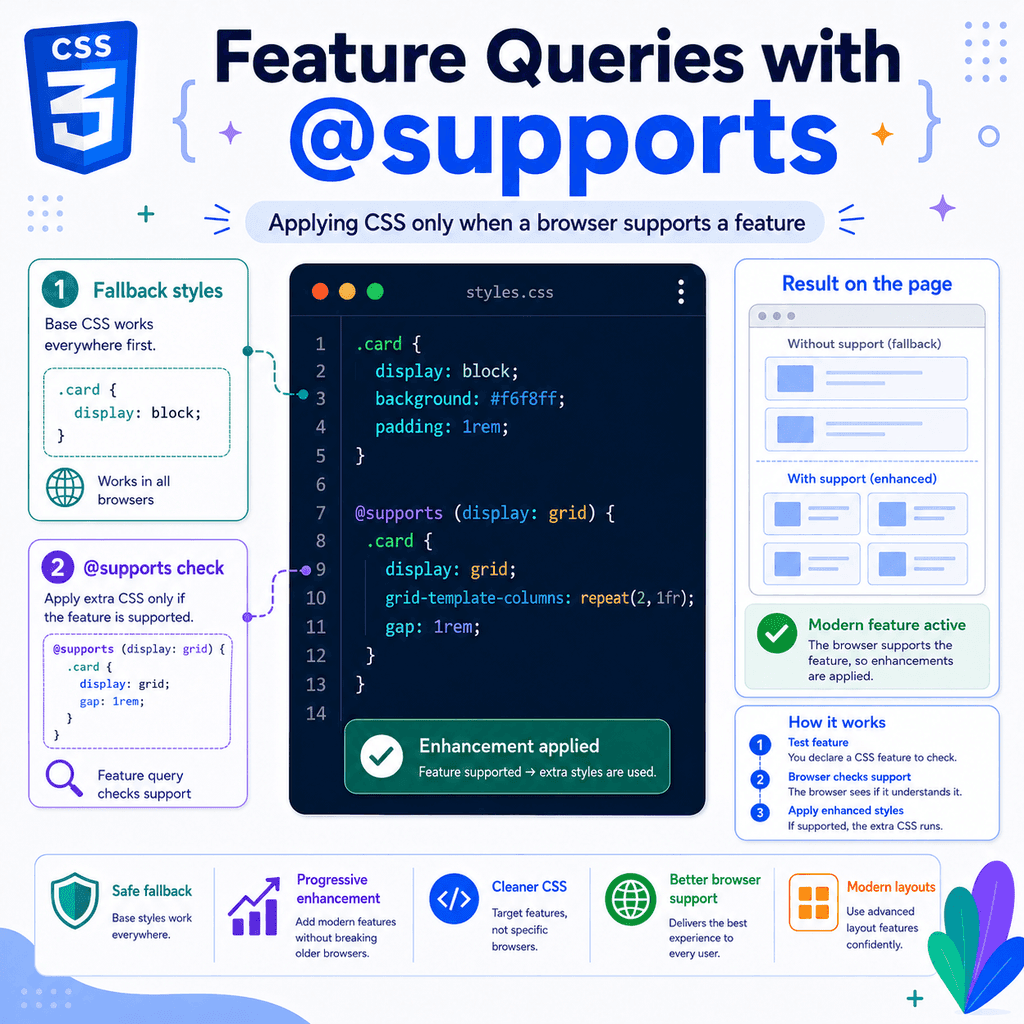
Introduction
CSS keeps adding new features.
Modern CSS includes tools such as:
display: grid;aspect-ratio: 16 / 9;container-type: inline-size;backdrop-filter: blur(10px);These features can be useful, but not every browser always supports every CSS feature.
A feature query lets you ask the browser:
Do you support this CSS feature?If the browser supports it, the browser applies the CSS inside the feature query.
If the browser does not support it, the browser ignores that CSS block.
Feature queries use the @supports at-rule.
Example:
@supports (display: grid) { .layout { display: grid; }}This means:
If the browser supports display: grid, apply these styles.Feature queries are useful when you want to use modern CSS safely.
They help you write fallback styles first, then add enhanced styles only when the browser supports them.
What Is @supports?
@supports is a CSS at-rule.
It checks whether the browser supports a CSS declaration.
A basic feature query looks like this:
@supports (property: value) { selector { property: value; }}Example:
@supports (display: flex) { .nav { display: flex; gap: 1rem; }}The condition is:
(display: flex)The CSS inside the block only applies if the browser supports that declaration.
If the browser does not support display: flex, the browser ignores the whole @supports block.
Why Feature Queries Are Useful
Feature queries are useful because CSS support can vary.
A browser may support one feature but not another.
Instead of guessing, you can test support directly.
Example:
.card { height: 200px;} @supports (aspect-ratio: 1 / 1) { .card { height: auto; aspect-ratio: 1 / 1; }}This gives older browsers a fallback height.
Browsers that support aspect-ratio get the modern version.
The main idea is:
Write safe CSS first.Add modern CSS inside @supports.Basic Syntax
The basic syntax is:
@supports (property: value) { /* CSS rules go here */}Example:
@supports (display: grid) { .gallery { display: grid; grid-template-columns: repeat(3, 1fr); gap: 1rem; }}The browser checks this part:
(display: grid)If that declaration is supported, the styles inside the block are used.
A Simple Example
HTML:
<div class=”layout”> <aside>Sidebar</aside> <main>Main content</main></div>Fallback CSS:
.layout { display: block;}Enhanced CSS:
@supports (display: grid) { .layout { display: grid; grid-template-columns: 16rem 1fr; gap: 2rem; }}Browsers without grid support use the block layout.
Browsers with grid support use the grid layout.
This is progressive enhancement.
Progressive Enhancement
Progressive enhancement means starting with a basic version that works broadly.
Then you add better styling for browsers that support newer features.
Example:
.card { padding: 1rem; border: 1px solid #dddddd;} @supports (box-shadow: 0 4px 12px rgb(0 0 0 / 0.15)) { .card { border: 0; box-shadow: 0 4px 12px rgb(0 0 0 / 0.15); }}The card works without the enhancement.
Browsers that support the tested feature get the improved style.
This is safer than relying on modern CSS without a fallback.
Fallback First, Enhancement Second
A common pattern is:
.element { fallback styles} @supports (modern-property: modern-value) { .element { enhanced styles }}Example:
.media { height: 250px;} @supports (aspect-ratio: 16 / 9) { .media { height: auto; aspect-ratio: 16 / 9; }}The fallback comes first.
The enhanced version comes second.
This works well because CSS later in the file can override earlier CSS when specificity is equal.
@supports Checks Declarations
Feature queries check whether a browser supports a CSS declaration.
A declaration is a property and value pair.
Example:
display: gridSo the condition must usually include both:
@supports (display: grid) { /* supported */}This is not enough:
@supports (display) { /* invalid */}The browser needs a property and value to test.
Testing a Property and Value
This checks whether the browser supports display: grid:
@supports (display: grid) { .layout { display: grid; }}This checks whether the browser supports backdrop-filter: blur(10px):
@supports (backdrop-filter: blur(10px)) { .glass { backdrop-filter: blur(10px); }}This checks whether the browser supports container-type: inline-size:
@supports (container-type: inline-size) { .card-list { container-type: inline-size; }}The test should match the feature you plan to use.
Example: Using @supports with Grid
HTML:
<div class=”cards”> <article>One</article> <article>Two</article> <article>Three</article></div>Fallback CSS:
.cards > * { margin-bottom: 1rem;}Enhanced CSS:
@supports (display: grid) { .cards { display: grid; grid-template-columns: repeat(3, 1fr); gap: 1rem; } .cards > * { margin-bottom: 0; }}Older browsers use vertical spacing with margins.
Grid-supporting browsers use a grid layout with gap.
The fallback is simple.
The enhancement is more advanced.
Example: Using @supports with Flexbox Gap
Flexbox support and gap support are not exactly the same.
A browser may support Flexbox but not support gap in Flexbox.
You can test for gap support:
@supports (gap: 1rem) { .nav { gap: 1rem; }}However, gap can also apply to grid.
So this test tells you whether the browser supports the gap property generally, not necessarily every layout context in older edge cases.
A practical fallback is:
.nav { display: flex;} .nav > * + * { margin-left: 1rem;} @supports (gap: 1rem) { .nav { gap: 1rem; } .nav > * + * { margin-left: 0; }}This gives you a margin fallback and a gap enhancement.
Example: Using @supports with aspect-ratio
The aspect-ratio property is useful for media boxes.
HTML:
<div class=”video”></div>Fallback CSS:
.video { height: 250px; background-color: #dddddd;}Enhanced CSS:
@supports (aspect-ratio: 16 / 9) { .video { height: auto; aspect-ratio: 16 / 9; }}Browsers that support aspect-ratio use the correct ratio.
Browsers that do not support it still get a usable fixed-height box.
Example: Using @supports with backdrop-filter
The backdrop-filter property can create a frosted-glass effect.
Fallback CSS:
.panel { background-color: rgb(255 255 255 / 0.9);}Enhanced CSS:
@supports (backdrop-filter: blur(12px)) { .panel { background-color: rgb(255 255 255 / 0.65); backdrop-filter: blur(12px); }}The fallback uses a more solid background.
The enhanced version uses a more transparent background with blur.
This is a good pattern because the content remains readable either way.
Example: Using @supports with Container Queries
Container queries require a container.
Fallback CSS:
.card { padding: 1rem;}Enhanced CSS:
@supports (container-type: inline-size) { .card-wrapper { container-type: inline-size; } @container (min-width: 30rem) { .card { display: grid; grid-template-columns: 10rem 1fr; gap: 1rem; } }}The @supports block checks for container-type.
If the browser supports container queries, the browser applies the container setup and the container query.
If not, the fallback card layout still works.
The not Operator
You can use not to apply CSS when a feature is not supported.
Example:
@supports not (display: grid) { .layout { display: block; }}This means:
If display: grid is not supported, apply these styles.However, many developers prefer fallback-first CSS instead.
Instead of this:
@supports not (display: grid) { .layout { display: block; }} @supports (display: grid) { .layout { display: grid; }}You can usually write:
.layout { display: block;} @supports (display: grid) { .layout { display: grid; }}The fallback-first version is simpler.
When to Use not
Use not when you specifically need styles only for browsers that lack a feature.
Example:
@supports not (aspect-ratio: 1 / 1) { .square { height: 200px; }}This says:
Only use this fallback if aspect-ratio is not supported.But for most beginner-friendly CSS, fallback-first is easier:
.square { height: 200px;} @supports (aspect-ratio: 1 / 1) { .square { height: auto; aspect-ratio: 1 / 1; }}Use the approach that makes your CSS clearer.
The and Operator
You can require more than one feature.
Example:
@supports (display: grid) and (gap: 1rem) { .gallery { display: grid; gap: 1rem; }}This means:
Apply this CSS only if both display: grid and gap: 1rem are supported.Another example:
@supports (container-type: inline-size) and (aspect-ratio: 1 / 1) { .card { container-type: inline-size; } .thumbnail { aspect-ratio: 1 / 1; }}The and operator is useful when your enhancement depends on multiple features.
The or Operator
You can apply CSS if at least one feature is supported.
Example:
@supports (backdrop-filter: blur(10px)) or (-webkit-backdrop-filter: blur(10px)) { .glass { background-color: rgb(255 255 255 / 0.65); backdrop-filter: blur(10px); -webkit-backdrop-filter: blur(10px); }}This means:
Apply this CSS if either backdrop-filter or -webkit-backdrop-filter is supported.The or operator is useful when different browsers support different versions of a feature.
Grouping Conditions
You can group conditions with parentheses.
Example:
@supports ((display: grid) and (gap: 1rem)) or (display: flex) { .layout { gap: 1rem; }}This can be useful, but complex conditions can become hard to read.
Prefer simple feature queries when possible.
If a condition becomes too complicated, consider whether your fallback and enhancement structure can be simplified.
@supports with Selectors
Feature queries can also test selector support using selector().
Example:
@supports selector(:has(*)) { .field:has(input:focus) { outline: 2px solid #2563eb; }}This checks whether the browser supports the selector inside selector().
In this case, the selector being tested is:
:has(*)If the browser supports :has(), the rule inside the block can use it.
Example: Testing :has()
HTML:
<label class=”field”> Email <input type=”email”></label>Fallback CSS:
.field input:focus { outline: 2px solid #2563eb;}Enhanced CSS:
@supports selector(:has(*)) { .field { padding: 0.75rem; border: 1px solid #cccccc; } .field:has(input:focus) { border-color: #2563eb; } .field input:focus { outline: none; }}Browsers without :has() get the simple focus outline.
Browsers with :has() can style the parent label when the input is focused.
Why selector() Is Useful
Some modern CSS features are selectors, not property-value declarations.
For example:
:has():nth-child()::markerFor selector features, this syntax is useful:
@supports selector(:has(*)) { /* enhanced selector styles */}This is different from property testing:
@supports (display: grid) { /* enhanced property styles */}Use the correct type of test.
@supports with Custom Properties
CSS custom properties are widely supported in modern browsers.
You can test them like this:
@supports (–custom: property) { .box { –space: 1rem; padding: var(–space); }}However, feature queries for custom properties are not common in everyday CSS anymore.
A more useful pattern is testing the modern feature that uses the variable.
Example:
.card { width: 100%;} @supports (width: min(100%, 40rem)) { .card { width: min(100%, 40rem); }}This tests the actual modern value you want to use.
@supports and Unknown Features
If the browser does not understand the tested declaration, the condition is false.
Example:
@supports (made-up-property: made-up-value) { .box { color: red; }}Browsers do not support that made-up declaration.
So the CSS inside the block does not apply.
This is the main safety feature of @supports.
Unsupported enhancements are ignored.
@supports Does Not Load Polyfills
Feature queries do not add browser support.
They only check support.
This:
@supports (display: grid) { .layout { display: grid; }}does not make grid work in browsers that do not support grid.
It only applies the grid CSS if grid is already supported.
If you need a feature in unsupported browsers, you need a fallback, a different layout, a polyfill if available, or a different design decision.
@supports Does Not Test Design Quality
A browser may support a feature technically, but the design may still need testing.
Example:
@supports (backdrop-filter: blur(10px)) { .panel { backdrop-filter: blur(10px); }}The browser may support backdrop-filter.
But the text may still be hard to read.
Feature queries test support, not whether the result is accessible, readable, or visually good.
Always check the final design.
@supports and the Cascade
CSS inside an @supports block still follows the cascade.
Example:
.card { color: black;} @supports (display: grid) { .card { color: navy; }}If the browser supports grid, the card becomes navy.
Why?
Both selectors have the same specificity.
The @supports rule appears later.
So the later supported declaration wins.
If the browser does not support grid, the block is ignored and the card remains black.
Specificity Still Matters
Feature queries do not override specificity.
Example:
.card .title { color: red;} @supports (display: grid) { .title { color: blue; }}HTML:
<div class=”card”> <h2 class=”title”>Card title</h2></div>Even if grid is supported, the title may stay red.
Why?
The fallback selector is more specific:
.card .titleThe enhanced selector is less specific:
.titleIf you want the enhanced style to override the fallback, use a selector with enough specificity or organise your CSS differently.
Source Order Still Matters
If specificity is equal, later supported CSS wins.
Example:
.box { color: red;} @supports (display: grid) { .box { color: blue; }}The box becomes blue if the browser supports grid.
Now reverse the order:
@supports (display: grid) { .box { color: blue; }} .box { color: red;}The box becomes red because the later normal rule wins.
The @supports block does not automatically have higher priority.
It only controls whether its contents apply.
@supports and Cascade Layers
You can use @supports inside cascade layers.
Example:
@layer components { .card { display: block; } @supports (display: grid) { .card { display: grid; gap: 1rem; } }}Both the fallback and enhanced rule are in the components layer.
Inside the same layer, normal specificity and source order apply.
You can also put layers inside @supports:
@supports (display: grid) { @layer components { .card { display: grid; } }}For beginner projects, it is usually clearer to keep the layer structure simple.
@supports and Media Queries
You can combine feature queries with media queries.
Example:
@supports (display: grid) { @media (min-width: 800px) { .layout { display: grid; grid-template-columns: 16rem 1fr; gap: 2rem; } }}This means:
Only use this layout if grid is supported and the viewport is at least 800px wide.You can also nest @supports inside @media:
@media (min-width: 800px) { @supports (display: grid) { .layout { display: grid; } }}Both patterns can work.
Choose the structure that is easiest to read.
Example: Responsive Grid Enhancement
Fallback CSS:
.products > * { margin-bottom: 1rem;}Enhanced CSS:
@supports (display: grid) { @media (min-width: 700px) { .products { display: grid; grid-template-columns: repeat(3, 1fr); gap: 1rem; } .products > * { margin-bottom: 0; } }}This means:
Small screens use the simple fallback.Large screens with grid support use the grid layout.This is a practical use of @supports with @media.
Feature Queries Are Not Browser Queries
Feature queries are different from browser detection.
A browser query would ask:
Is this Chrome?Is this Safari?Is this Firefox?A feature query asks:
Do you support this CSS feature?This is usually better.
Browsers change over time.
A specific browser version may support one feature but not another.
Testing the actual feature is more reliable than testing the browser name.
Do Not Use @supports for Everything
You do not need feature queries around every CSS declaration.
This is unnecessary:
@supports (color: red) { p { color: red; }}Basic CSS features are widely supported.
Use @supports when:
the feature is modernsupport may varythe feature is important to the layoutyou need a fallbackyou are using a selector that may not be supportedDo not add feature queries just to make CSS look more advanced.
Use @supports for Riskier Enhancements
Good candidates for feature queries include:
container queries:has()aspect-ratio in older support contextsbackdrop-filternewer viewport unitsnewer layout featuresadvanced color functionsmodern CSS functionsExample:
@supports (height: 100dvh) { .app { min-height: 100dvh; }}This applies the dynamic viewport height only when supported.
Example: Modern Viewport Unit Fallback
Fallback CSS:
.app { min-height: 100vh;}Enhanced CSS:
@supports (height: 100dvh) { .app { min-height: 100dvh; }}This is useful for mobile layouts.
Older browsers use 100vh.
Browsers that support dvh use 100dvh.
A shorter pattern is also common:
.app { min-height: 100vh; min-height: 100dvh;}But @supports can make the fallback logic more explicit.
Example: Modern Color Fallback
Fallback CSS:
.badge { background-color: rgb(37 99 235);}Enhanced CSS:
@supports (background-color: color-mix(in srgb, blue, white)) { .badge { background-color: color-mix(in srgb, blue 80%, white); }}The fallback uses a normal RGB colour.
The enhanced version uses color-mix().
This lets you use newer color features while keeping a safe fallback.
Example: position: sticky
Fallback CSS:
.sidebar { position: static;}Enhanced CSS:
@supports (position: sticky) { .sidebar { position: sticky; top: 1rem; }}Browsers that support sticky positioning get the sticky sidebar.
Browsers that do not support it use normal static positioning.
The page still works.
Example: subgrid
CSS Grid subgrid is a more advanced layout feature.
Fallback:
.card { display: grid; gap: 1rem;}Enhancement:
@supports (grid-template-columns: subgrid) { .card-list { display: grid; grid-template-columns: repeat(3, 1fr); } .card { display: grid; grid-template-columns: subgrid; }}This applies subgrid only when supported.
Without subgrid, the card still has a normal grid layout.
Example: :has() Enhancement
HTML:
<div class=”todo”> <input type=”checkbox” id=”task”> <label for=”task”>Finish lesson</label></div>Fallback CSS:
.todo input:checked + label { text-decoration: line-through;}Enhanced CSS:
@supports selector(:has(*)) { .todo:has(input:checked) { opacity: 0.6; }}The fallback styles the label.
The enhancement styles the whole .todo item when the checkbox is checked.
@supports with Vendor-Prefixed Features
Some features may have prefixed versions in some browsers.
Example:
@supports (backdrop-filter: blur(10px)) or (-webkit-backdrop-filter: blur(10px)) { .glass { background-color: rgb(255 255 255 / 0.65); backdrop-filter: blur(10px); -webkit-backdrop-filter: blur(10px); }}This checks for either the standard property or the prefixed version.
Use prefixes only when needed.
Do not add old prefixes blindly.
Common Mistake: No Fallback
This is risky:
@supports (display: grid) { .layout { display: grid; grid-template-columns: 1fr 2fr; }}If grid is not supported, .layout has no fallback layout.
Better:
.layout { display: block;} @supports (display: grid) { .layout { display: grid; grid-template-columns: 1fr 2fr; }}The page still works without the enhancement.
Common Mistake: Testing the Wrong Feature
This test:
@supports (display: grid) { .card { aspect-ratio: 1 / 1; }}checks for grid support, but the CSS inside uses aspect-ratio.
That may be the wrong test.
Better:
@supports (aspect-ratio: 1 / 1) { .card { aspect-ratio: 1 / 1; }}Test the feature your enhancement actually needs.
Common Mistake: Thinking @supports Overrides Everything
This is wrong:
CSS inside @supports always wins.The correct idea is:
CSS inside @supports applies only when the condition is true.After that, it still follows the cascade.Specificity, source order, cascade layers, and !important still matter.
Example:
.card .title { color: red;} @supports (display: grid) { .title { color: blue; }}The title may stay red because .card .title is more specific.
Common Mistake: Making Conditions Too Complicated
This is hard to read:
@supports ((display: grid) and (gap: 1rem)) or ((display: flex) and (not (gap: 1rem))) { .layout { margin: 0; }}A simpler fallback-first structure is usually better.
Example:
.layout > * + * { margin-top: 1rem;} @supports (display: grid) and (gap: 1rem) { .layout { display: grid; gap: 1rem; } .layout > * + * { margin-top: 0; }}Readable CSS is easier to maintain.
Common Mistake: Using @supports as a Browser Hack
Avoid using feature queries to target a browser indirectly unless you have a strong reason.
Bad idea:
@supports (-webkit-touch-callout: none) { /* Safari-only hack */}This kind of CSS can be fragile.
Prefer testing the actual feature you need.
If you are fixing a browser bug, document the reason with a comment.
Common Mistake: Forgetting Older Browsers May Ignore @supports
Browsers that do not support @supports ignore the whole block.
That is usually fine if your fallback is outside the block.
Example:
.layout { display: block;} @supports (display: grid) { .layout { display: grid; }}An old browser that does not understand @supports keeps the block layout.
This is another reason fallback-first CSS is safer.
Debugging @supports
When CSS inside @supports does not apply, ask:
Does the browser support @supports?Is the condition true?Are you testing the correct property and value?Is the selector inside the block matching the element?Is another rule overriding it?Is specificity involved?Is source order involved?Are cascade layers involved?Is the rule inside a media query too?Is the browser ignoring an invalid declaration?Use browser developer tools to inspect which declarations are active.
Checking Support in Developer Tools
Most browser developer tools show which CSS rules apply.
If your @supports block does not appear or appears inactive, the condition may be false.
Try testing a simpler condition:
@supports (display: grid) { .test { outline: 3px solid red; }}If the outline appears, the condition is true and the selector matches.
If not, check the condition, selector, and stylesheet loading.
A Practical Debugging Example
CSS:
.card { display: block;} @supports (display: grid) { .card { display: grid; gap: 1rem; }}Problem:
The card is still block layout.Debug:
Does the browser support display: grid?Does the .card selector match?Is another .card rule later in the CSS setting display: block?Is the rule inside another condition such as @media?Is the CSS file loaded?If another later rule exists:
.card { display: block;}after the @supports block, it may override the grid layout.
Full Example: Layout Enhancement
HTML:
<div class=”page-layout”> <aside class=”sidebar”>Sidebar</aside> <main class=”content”>Main content</main></div>CSS:
.page-layout { display: block;} .sidebar { margin-bottom: 1rem;} @supports (display: grid) { .page-layout { display: grid; grid-template-columns: 16rem 1fr; gap: 2rem; } .sidebar { margin-bottom: 0; }}Without grid support, the sidebar stacks above the content.
With grid support, the layout becomes two columns.
The fallback is usable.
The enhancement is better.
Full Example: Card Image Ratio
HTML:
<article class=”card”> <div class=”card-image”></div> <h2>Card Title</h2> <p>Card text.</p></article>CSS:
.card-image { height: 12rem; background-color: #dddddd;} @supports (aspect-ratio: 16 / 9) { .card-image { height: auto; aspect-ratio: 16 / 9; }}Browsers without aspect-ratio get a fixed-height image area.
Browsers with aspect-ratio get a responsive ratio-based image area.
Full Example: Frosted Panel
HTML:
<div class=”hero”> <div class=”panel”> <h1>Welcome</h1> <p>This panel uses a fallback and an enhancement.</p> </div></div>CSS:
.panel { background-color: rgb(255 255 255 / 0.9); padding: 2rem; border-radius: 1rem;} @supports (backdrop-filter: blur(12px)) { .panel { background-color: rgb(255 255 255 / 0.65); backdrop-filter: blur(12px); }}The panel is readable without the blur effect.
Browsers that support backdrop-filter get the enhanced frosted appearance.
Full Example: Parent Focus with :has()
HTML:
<label class=”input-field”> <span>Email address</span> <input type=”email”></label>CSS:
.input-field input:focus { outline: 2px solid #2563eb;} @supports selector(:has(*)) { .input-field { display: grid; gap: 0.5rem; padding: 1rem; border: 1px solid #cccccc; } .input-field:has(input:focus) { border-color: #2563eb; } .input-field input:focus { outline: none; }}Without :has(), the input itself gets a focus outline.
With :has(), the parent field gets a highlighted border.
The fallback remains accessible.
Full Example: Dynamic Viewport Height
HTML:
<div class=”app”> <header>Header</header> <main>Main content</main> <footer>Footer</footer></div>CSS:
.app { min-height: 100vh; display: grid; grid-template-rows: auto 1fr auto;} @supports (height: 100dvh) { .app { min-height: 100dvh; }}Older browsers use 100vh.
Browsers with dynamic viewport height support use 100dvh.
This is helpful for modern mobile layouts.
Full Example: Container Query Enhancement
HTML:
<div class=”card-container”> <article class=”card”> <h2>Card Title</h2> <p>Card text.</p> </article></div>CSS:
.card { padding: 1rem; border: 1px solid #dddddd;} @supports (container-type: inline-size) { .card-container { container-type: inline-size; } @container (min-width: 35rem) { .card { display: grid; grid-template-columns: 12rem 1fr; gap: 1rem; } }}Without container query support, the card remains a simple block.
With container query support, the card can change layout based on its container.
Best Practices for @supports
Write fallback CSS first.
Use @supports for modern enhancements.
Test the feature you actually use.
Keep feature query conditions simple.
Remember that CSS inside @supports still follows the cascade.
Use selector() when testing selector support.
Use and when an enhancement requires multiple features.
Use or when different supported forms are acceptable.
Avoid using @supports as a browser hack.
Do not wrap basic CSS in unnecessary feature queries.
Make sure the fallback is usable.
Test the result in real browsers when the feature is important.
Quick Reference
Basic feature query:
@supports (display: grid) { .layout { display: grid; }}Fallback plus enhancement:
.layout { display: block;} @supports (display: grid) { .layout { display: grid; }}Not supported:
@supports not (display: grid) { .layout { display: block; }}Multiple required features:
@supports (display: grid) and (gap: 1rem) { .layout { display: grid; gap: 1rem; }}Either feature:
@supports (backdrop-filter: blur(10px)) or (-webkit-backdrop-filter: blur(10px)) { .glass { backdrop-filter: blur(10px); -webkit-backdrop-filter: blur(10px); }}Selector support:
@supports selector(:has(*)) { .field:has(input:focus) { border-color: blue; }}Quick Summary
Feature queries use @supports.
They let you apply CSS only when a browser supports a feature.
The basic syntax is:
@supports (property: value) { selector { property: value; }}Feature queries are useful for progressive enhancement.
Write a safe fallback first.
Then place modern CSS inside an @supports block.
Use not to target browsers without a feature.
Use and when multiple features are required.
Use or when any one of several features is acceptable.
Use selector() to test support for modern selectors such as :has().
Remember that @supports checks feature support, not browser identity.
It does not add support to old browsers.
It only applies CSS when support already exists.
CSS inside @supports still follows normal cascade rules, including specificity, source order, cascade layers, and !important.
Use feature queries when they make your CSS safer, clearer, and more resilient.