
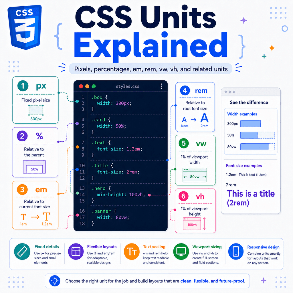
Introduction
CSS uses units to describe sizes.
You use units for things like:
font-size: 16px;padding: 1rem;width: 50%;height: 100vh;A unit tells the browser how large something should be.
Some units are fixed.
Some units are relative.
Some units depend on the parent element.
Some depend on the root font size.
Some depend on the size of the browser viewport.
Understanding CSS units helps you control spacing, text size, layout, and responsive design more confidently.
The most common CSS units include:
px%emremvwvhvminvmaxchexlhrlhYou do not need to use every unit immediately.
For most everyday CSS, you will use a small set often:
px%emremvwvhThis guide explains what those units mean, how they behave, and when to use them.
What Is a CSS Unit?
A CSS unit describes a measurement.
Example:
.box { width: 300px;}The value is:
300pxThis has two parts:
300 = the numberpx = the unitTogether, they tell the browser how wide the box should be.
Another example:
.card { padding: 2rem;}The value is:
2remThis means the padding is based on the root font size.
CSS units let you describe sizes in different ways depending on what you are trying to build.
Absolute and Relative Units
CSS units can be grouped into two broad categories:
absolute unitsrelative unitsAbsolute units are fixed in relation to a physical or reference measurement.
The most common absolute unit in web design is:
pxRelative units depend on something else.
Examples:
%emremvwvhchlhRelative units are often better for responsive design because they can adapt to context.
The px Unit
The px unit means CSS pixel.
Example:
p { font-size: 16px;}This sets the paragraph font size to 16px.
Pixels are easy to understand because they feel direct.
Example:
.card { width: 300px; padding: 20px; border-radius: 8px;}This gives the card a fixed width, fixed padding, and fixed corner radius.
Pixels are useful when you want a precise size.
Common Uses for px
Pixels are commonly used for:
borderssmall spacing valuesicon sizesbox shadowsborder-radiusprecise layout detailsExamples:
.button { border: 1px solid #cccccc; border-radius: 8px;}.icon { width: 24px; height: 24px;}.card { box-shadow: 0 4px 12px rgb(0 0 0 / 0.15);}For small visual details, pixels are often simple and practical.
Pixels Are Not Always Best for Responsive Layout
A fixed pixel width can cause problems on small screens.
Example:
.card { width: 600px;}On a wide screen, this may look fine.
On a narrow phone screen, 600px may be too wide.
The card may overflow the viewport.
A more flexible version is:
.card { width: 100%; max-width: 600px;}This means:
Use the available width.But do not grow wider than 600px.This is a common responsive pattern.
The % Unit
The percentage unit is relative to another size.
Example:
.box { width: 50%;}This usually means the box should be half the width of its containing block.
HTML:
<div class=”container”> <div class=”box”>Box</div></div>CSS:
.container { width: 800px;} .box { width: 50%;}The .box width becomes 400px.
Why?
Because 50% of 800px is 400px.
Percentages Depend on the Property
Percentages do not always refer to the same thing.
For width, a percentage usually refers to the width of the containing block.
Example:
.child { width: 50%;}For height, a percentage depends on whether the parent has a definite height.
Example:
.parent { height: 400px;} .child { height: 50%;}The child height becomes 200px.
But this may not work as expected:
.parent { /* no fixed height */} .child { height: 50%;}If the parent height is not definite, the child’s percentage height may not resolve the way you expect.
This is a common layout issue.
Percentage Width Example
HTML:
<div class=”wrapper”> <div class=”sidebar”>Sidebar</div> <div class=”content”>Content</div></div>CSS:
.wrapper { width: 100%;} .sidebar { width: 30%;} .content { width: 70%;}The sidebar takes 30% of the wrapper.
The content takes 70% of the wrapper.
Percentages are useful when you want flexible layouts.
However, modern layout tools such as Flexbox and Grid often make this easier.
Example with Flexbox:
.wrapper { display: flex;} .sidebar { flex: 0 0 30%;} .content { flex: 1;}Percentages for Spacing
Percentages can also be used for padding and margins.
Example:
.box { padding: 10%;}This can be surprising.
Percentage padding is often based on the width of the containing block, not the height.
Example:
.box { padding-top: 50%;}This can be used to create aspect-ratio tricks, although modern CSS has a better property:
.box { aspect-ratio: 16 / 9;}Use percentage spacing carefully because it may not behave the way beginners expect.
The em Unit
The em unit is relative to font size.
In many cases:
1em = the font size of the current elementExample:
p { font-size: 20px; margin-bottom: 1em;}Here, the paragraph font size is 20px.
So:
1em = 20pxThe paragraph’s bottom margin becomes 20px.
If the font size changes, the em value changes too.
em for Font Size
When em is used for font-size, it is relative to the parent element’s font size.
Example:
.parent { font-size: 20px;} .child { font-size: 1.5em;}HTML:
<div class=”parent”> <p class=”child”>Text</p></div>The child font size becomes 30px.
Why?
1.5em = 1.5 × parent font size1.5 × 20px = 30pxThis is useful, but it can also create compounding effects.
em Can Compound
Nested em font sizes can grow or shrink through the HTML tree.
Example:
.list { font-size: 1.2em;}HTML:
<ul class=”list”> <li>First item</li> <li> Second item <ul class=”list”> <li>Nested item</li> </ul> </li></ul>If each nested .list uses font-size: 1.2em, the nested list becomes larger than the parent list.
This happens because each level is based on the font size of its parent.
That can be useful in some designs.
But it can also be accidental.
em for Padding and Margin
When em is used for properties other than font-size, it is usually relative to the element’s own font size.
Example:
.button { font-size: 16px; padding: 0.75em 1em;}The vertical padding is:
0.75 × 16px = 12pxThe horizontal padding is:
1 × 16px = 16pxIf the button font size increases, the padding increases too.
Example:
.button-large { font-size: 20px;}A larger button gets larger padding automatically.
This is one of the best uses of em.
Practical em Button Example
HTML:
<button class=”button”>Save</button><button class=”button button-large”>Continue</button>CSS:
.button { font-size: 1rem; padding: 0.75em 1em; border-radius: 0.5em;} .button-large { font-size: 1.25rem;}The large button has a larger font size.
Because padding and border radius use em, they scale with the button text.
This keeps the button proportions consistent.
When to Use em
Use em when a size should scale with the current element’s font size.
Good uses:
.button { padding: 0.75em 1em;}.badge { border-radius: 0.5em;}.icon { width: 1em; height: 1em;}This is useful for components where spacing should adjust with text size.
Be careful when using em for nested font sizes because values can compound.
The rem Unit
The rem unit means root em.
It is relative to the root element’s font size.
The root element is usually:
<html>In many browsers, the default root font size is commonly 16px.
So if the root font size is 16px:
1rem = 16px2rem = 32px0.5rem = 8pxExample:
.card { padding: 2rem;}If 1rem is 16px, then 2rem is 32px.
rem Depends on the Root Font Size
Example:
html { font-size: 16px;} .card { padding: 2rem;}The padding is 32px.
Now change the root font size:
html { font-size: 20px;} .card { padding: 2rem;}The padding becomes 40px.
Why?
2rem = 2 × root font size2 × 20px = 40pxThis makes rem useful for consistent spacing systems.
rem Does Not Compound Like em
This is a major difference.
Example:
.parent { font-size: 20px;} .child { margin-top: 2rem;}The child’s margin is based on the root font size, not the parent font size.
If the root is 16px, then:
2rem = 32pxThe parent’s 20px font size does not change the rem margin.
This makes rem more predictable than em for page-level spacing.
Common Uses for rem
The rem unit is commonly used for:
font sizespaddingmargingapmax-widthlayout spacingExamples:
body { font-size: 1rem;}.card { padding: 1.5rem; margin-bottom: 2rem;}.grid { gap: 1rem;}.container { max-width: 70rem;}rem is often a good default unit for spacing and typography.
rem for Font Sizes
Example:
body { font-size: 1rem;} h1 { font-size: 2.5rem;} p { font-size: 1rem;}If the root font size is 16px, then:
h1 = 40pxp = 16pxUsing rem can help keep type sizes consistent across the site.
It also respects changes to the root font size.
Avoid Setting html { font-size: 10px; }
Some older CSS tutorials use this pattern:
html { font-size: 10px;}Then:
1.6rem = 16pxThis may seem convenient for math.
But it can interfere with user font size preferences.
A safer approach is to leave the root font size alone or use percentages carefully.
Example:
html { font-size: 100%;}Then use rem normally:
body { font-size: 1rem;}This is usually more respectful of browser and user settings.
em vs rem
The difference is:
em = relative to the current element or parent font size, depending on the propertyrem = relative to the root font sizeExample:
html { font-size: 16px;} .parent { font-size: 20px;} .child-em { font-size: 2em;} .child-rem { font-size: 2rem;}The .child-em font size is:
2 × 20px = 40pxThe .child-rem font size is:
2 × 16px = 32pxem depends on local context.
rem depends on the root.
When to Use em vs rem
Use rem for consistent site-wide sizing.
Examples:
.card { padding: 1.5rem;}h1 { font-size: 2.5rem;}Use em when a value should scale with the element’s own text size.
Examples:
.button { padding: 0.75em 1em;}.icon { width: 1em; height: 1em;}A practical rule is:
Use rem for layout spacing.Use em for component parts that should scale with text.This is not a strict rule, but it works well in many projects.
The vw Unit
The vw unit means viewport width.
The viewport is the visible area of the browser window.
1vw = 1% of the viewport widthSo:
100vw = full viewport width50vw = half viewport widthExample:
.hero { width: 100vw;}This makes the hero as wide as the viewport.
vw Example
If the viewport is 1200px wide:
1vw = 12px10vw = 120px50vw = 600px100vw = 1200pxCSS:
.hero-title { font-size: 8vw;}At 1200px wide:
8vw = 96pxAt 400px wide:
8vw = 32pxThe font size changes with the viewport width.
This can be useful for responsive headings, but it needs limits.
Be Careful with 100vw
This can sometimes cause horizontal scrolling:
.section { width: 100vw;}Why?
On some pages, the vertical scrollbar takes up space.
100vw can include the scrollbar area, making the element slightly wider than the visible page content.
Often this is safer:
.section { width: 100%;}Use 100vw when you specifically need viewport-based width.
Use 100% when you want to fill the parent.
vw for Responsive Typography
Viewport units can create fluid typography.
Example:
h1 { font-size: 8vw;}But this can become too small on narrow screens and too large on wide screens.
A better modern approach is clamp():
h1 { font-size: clamp(2rem, 8vw, 5rem);}This means:
minimum: 2rempreferred: 8vwmaximum: 5remThe heading scales with the viewport, but it does not become smaller than 2rem or larger than 5rem.
The vh Unit
The vh unit means viewport height.
1vh = 1% of the viewport heightSo:
100vh = full viewport height50vh = half viewport heightExample:
.hero { min-height: 100vh;}This makes the hero at least as tall as the viewport.
This is common for full-screen hero sections.
vh Example
If the viewport is 800px tall:
1vh = 8px50vh = 400px100vh = 800pxCSS:
.panel { min-height: 50vh;}The panel is at least half the viewport height.
Be Careful with 100vh on Mobile
On mobile browsers, the visible viewport can change as the browser address bar appears or disappears.
This can make 100vh behave unexpectedly.
Modern CSS has newer viewport units to help with this:
svhlvhdvhThese are related to viewport height but handle mobile browser UI in different ways.
A common modern option is:
.hero { min-height: 100dvh;}The dvh unit tracks the dynamic viewport height.
New Viewport Units: svh, lvh, and dvh
CSS has newer viewport height units:
svh = small viewport heightlvh = large viewport heightdvh = dynamic viewport heightThese are useful for mobile layouts.
The small viewport height is based on the smaller possible viewport.
The large viewport height is based on the larger possible viewport.
The dynamic viewport height updates as the browser interface changes.
Example:
.hero { min-height: 100dvh;}This can be better than 100vh for full-height sections on mobile devices.
Viewport Width Variants
There are also width-related dynamic viewport units:
svwlvwdvwThey follow the same idea as the height units but apply to viewport width.
In many layouts, vw is still enough for width.
The height units are often more noticeable on mobile because browser toolbars affect vertical space.
The vmin Unit
The vmin unit is based on the smaller viewport dimension.
1vmin = 1% of the smaller side of the viewportIf the viewport is:
1200px wide800px tallThe smaller side is 800px.
So:
1vmin = 8pxExample:
.logo { width: 20vmin; height: 20vmin;}This keeps the logo size related to the smaller side of the viewport.
The vmax Unit
The vmax unit is based on the larger viewport dimension.
1vmax = 1% of the larger side of the viewportIf the viewport is:
1200px wide800px tallThe larger side is 1200px.
So:
1vmax = 12pxExample:
.background-shape { width: 80vmax; height: 80vmax;}This can be useful for large decorative elements.
vmin and vmax Example
CSS:
.circle { width: 30vmin; height: 30vmin; border-radius: 50%;}The circle scales with the smaller viewport dimension.
This helps it fit on both portrait and landscape screens.
For example:
viewport: 1000px × 600px30vmin = 30% of 600px = 180pxviewport: 400px × 800px30vmin = 30% of 400px = 120pxThe circle stays proportional to the available screen.
The ch Unit
The ch unit is based on the width of the 0 character in the current font.
Example:
p { max-width: 65ch;}This means the paragraph can be about 65 characters wide.
This is useful for readable text lines.
Long lines can be hard to read.
A common pattern is:
.article { max-width: 65ch;}This keeps article text at a comfortable line length.
ch Example
HTML:
<article class=”article”> <p> CSS units help control size, spacing, and layout. </p></article>CSS:
.article { max-width: 65ch;}The article width is based on the font’s character width.
This is often more meaningful for text than using a fixed pixel width.
Compare:
.article { max-width: 700px;}This is based on pixels.
.article { max-width: 65ch;}This is based on readable line length.
The ex Unit
The ex unit is based on the x-height of the current font.
The x-height is roughly the height of lowercase letters such as x.
Example:
.icon { height: 1ex;}In everyday CSS, ex is less commonly used than em, rem, or ch.
You may see it in typography-focused layouts.
For most beginner projects, you do not need to use ex often.
The lh Unit
The lh unit is based on the computed line height of the element.
Example:
p { line-height: 1.6; margin-bottom: 1lh;}This sets the bottom margin to one line height.
If the paragraph line height changes, the margin changes with it.
This can be useful for typography and vertical rhythm.
The rlh Unit
The rlh unit is based on the root element’s line height.
It is similar in idea to rem, but for line height.
Example:
.section { padding-block: 2rlh;}This sets vertical padding based on the root line height.
In many beginner projects, rem is more common.
But lh and rlh can be useful when spacing should follow line height.
The fr Unit
The fr unit is used in CSS Grid.
It means a fraction of available space.
Example:
.grid { display: grid; grid-template-columns: 1fr 2fr;}This creates two columns.
The second column gets twice as much available space as the first.
If the available width is 900px, and there are no gaps:
1fr + 2fr = 3frfirst column = 300pxsecond column = 600pxThe fr unit is not used everywhere.
It is mainly for CSS Grid track sizing.
fr Example
HTML:
<div class=”layout”> <aside>Sidebar</aside> <main>Main content</main></div>CSS:
.layout { display: grid; grid-template-columns: 1fr 3fr; gap: 1rem;}The main content column is three times as wide as the sidebar column.
The fr unit makes proportional grid layouts easier.
Time Units: s and ms
CSS also has time units.
They are used for animations and transitions.
Examples:
.button { transition: background-color 200ms ease;}.spinner { animation: spin 1s linear infinite;}The units are:
s = secondsms = millisecondsExamples:
1s = 1000ms0.5s = 500ms200ms = 0.2sThese are not layout units, but they are still CSS units.
Angle Units: deg, turn, rad, and grad
CSS has angle units for rotations and gradients.
The most common is:
degExample:
.arrow { transform: rotate(45deg);}You may also see:
.spinner { transform: rotate(0.5turn);}Here:
1turn = 360deg0.5turn = 180degFor most beginner CSS, deg is the easiest angle unit to use.
Resolution Units
CSS also has resolution units such as:
dpidppxdpcmThese are used in media queries and image-related contexts.
Example:
@media (min-resolution: 2dppx) { .logo { background-image: url(“logo@2x.png”); }}These are more advanced and less common in beginner layout work.
You do not need them for basic sizing and spacing.
Choosing the Right Unit
There is no single best CSS unit.
The best unit depends on what the value should respond to.
Ask:
Should this size stay fixed?Should it scale with text?Should it scale with the root font size?Should it scale with the parent?Should it scale with the viewport?Should it represent readable line length?Should it divide available grid space?Then choose the unit that matches the behaviour you want.
Use px for Small Fixed Details
Good uses:
.card { border: 1px solid #dddddd; border-radius: 8px;}.icon { width: 24px; height: 24px;}Pixels are clear and predictable for small visual details.
Avoid using fixed pixel sizes for everything.
Too many fixed sizes can make layouts less responsive.
Use % for Parent-Based Sizing
Good uses:
.image { width: 100%;}.sidebar { width: 30%;}.progress-bar { width: 75%;}Percentages are useful when the size should relate to the parent or containing block.
Be careful with percentage heights.
They need a definite parent height to behave predictably.
Use rem for Consistent Spacing
Good uses:
.card { padding: 1.5rem; margin-bottom: 2rem;}.grid { gap: 1rem;}h1 { font-size: 2.5rem;}rem is predictable because it is based on the root font size.
It is often a strong default choice for typography and spacing.
Use em for Component Scaling
Good uses:
.button { padding: 0.75em 1em;}.badge { font-size: 0.875rem; padding: 0.25em 0.5em;}.icon { width: 1em; height: 1em;}em is useful when the spacing or size should scale with the component’s text.
Use vw and vh for Viewport-Based Layout
Good uses:
.hero { min-height: 100vh;}.full-width { width: 100vw;}.heading { font-size: clamp(2rem, 6vw, 5rem);}Viewport units are useful for full-screen sections and fluid typography.
Be careful with 100vh on mobile.
Consider 100dvh when you need dynamic viewport height.
Use ch for Readable Text Width
Good use:
.article { max-width: 65ch;}This keeps text lines at a readable length.
The ch unit is especially useful for articles, documentation, blog posts, and long-form text.
Use fr for Grid Columns
Good use:
.layout { display: grid; grid-template-columns: 1fr 3fr; gap: 1rem;}The fr unit is designed for CSS Grid.
Use it to divide available space into flexible tracks.
Common Mistake: Using px for Everything
This can work at first:
.card { width: 600px; padding: 40px; font-size: 18px;}But it may not adapt well to different screens or user settings.
A more flexible version:
.card { width: 100%; max-width: 37.5rem; padding: 2rem; font-size: 1rem;}This combines flexible width, a maximum size, and root-relative spacing.
Common Mistake: Confusing em and rem
This can surprise you:
.parent { font-size: 20px;} .child { font-size: 2em;}The child is 40px.
If you expected it to be based on the root font size, use rem:
.child { font-size: 2rem;}Remember:
em follows local font size.rem follows root font size.Common Mistake: Percentage Heights Not Working
This often does not work as expected:
.child { height: 100%;}Why?
The parent may not have a definite height.
Example:
.parent { /* no set height */} .child { height: 100%;}The child does not know what 100% should be based on.
A possible fix:
.parent { height: 400px;} .child { height: 100%;}Or use viewport height if you want full-screen height:
.child { min-height: 100vh;}Common Mistake: 100vw Causing Horizontal Scroll
This can create unwanted horizontal scrolling:
.full-width { width: 100vw;}If the page has a vertical scrollbar, 100vw may be slightly wider than the visible content area.
Often this is enough:
.full-width { width: 100%;}Use 100vw only when you specifically need the full viewport width.
Common Mistake: Viewport Text Too Large or Too Small
This can be risky:
h1 { font-size: 10vw;}On a very small screen, it may be too small or awkward.
On a very large screen, it may become too large.
Better:
h1 { font-size: clamp(2rem, 10vw, 6rem);}This keeps the font size within a useful range.
Common Mistake: Removing User Font Preferences
Avoid this unless you have a strong reason:
html { font-size: 10px;}This can interfere with user preferences.
A better default is:
html { font-size: 100%;}Then use rem values:
body { font-size: 1rem;}This keeps your CSS more flexible and accessible.
The calc() Function
The calc() function lets you mix units.
Example:
.sidebar { width: calc(100% – 2rem);}This means:
Take 100% of the available width and subtract 2rem.Another example:
.hero { min-height: calc(100vh – 4rem);}This can be useful when you need to account for a header height.
calc() Example
HTML:
<header class=”site-header”>Header</header><main class=”main”>Main content</main>CSS:
.site-header { height: 4rem;} .main { min-height: calc(100vh – 4rem);}The main area is at least the viewport height minus the header height.
This is a common layout pattern.
The min() Function
The min() function chooses the smaller value.
Example:
.card { width: min(100%, 40rem);}This means:
Use 100% width if it is smaller.Use 40rem if 40rem is smaller.This is useful for responsive containers.
It is similar to:
.card { width: 100%; max-width: 40rem;}The max() Function
The max() function chooses the larger value.
Example:
.box { width: max(20rem, 50%);}This means:
Use whichever is larger: 20rem or 50%.This is less common than min() and clamp(), but it is useful when something should not become too small.
The clamp() Function
The clamp() function sets a minimum, preferred value, and maximum.
Syntax:
clamp(minimum, preferred, maximum)Example:
h1 { font-size: clamp(2rem, 5vw, 4rem);}This means:
Do not go below 2rem.Prefer 5vw.Do not go above 4rem.This is excellent for fluid typography.
clamp() for Spacing
You can also use clamp() for spacing.
Example:
.section { padding-block: clamp(2rem, 8vw, 6rem);}On small screens, the section has at least 2rem vertical padding.
As the viewport grows, the padding grows.
But it stops at 6rem.
This creates responsive spacing without many media queries.
Building a Simple Spacing Scale
A spacing scale helps keep your design consistent.
Example:
:root { –space-1: 0.25rem; –space-2: 0.5rem; –space-3: 1rem; –space-4: 1.5rem; –space-5: 2rem;}Use it like this:
.card { padding: var(–space-4); margin-bottom: var(–space-5);}This keeps spacing consistent across the site.
Building a Simple Type Scale
A type scale helps keep text sizes consistent.
Example:
:root { –text-sm: 0.875rem; –text-base: 1rem; –text-lg: 1.25rem; –text-xl: 1.5rem; –text-2xl: 2rem;}Use it like this:
body { font-size: var(–text-base);} h1 { font-size: var(–text-2xl);} .small-text { font-size: var(–text-sm);}Using rem with custom properties makes the system predictable.
Practical Example: Responsive Container
HTML:
<div class=”container”> <h1>CSS Units</h1> <p>Units help control size, spacing, and layout.</p></div>CSS:
.container { width: min(100% – 2rem, 70rem); margin-inline: auto;}This means:
The container is almost full width on small screens.It has 1rem space on each side.It does not grow wider than 70rem.It is centred with auto margins.This is a clean responsive pattern.
Practical Example: Responsive Card
HTML:
<article class=”card”> <h2>Card Title</h2> <p>This card uses flexible CSS units.</p></article>CSS:
.card { width: min(100%, 36rem); padding: 1.5rem; border: 1px solid #dddddd; border-radius: 0.75rem;} .card h2 { font-size: 1.5rem; margin-bottom: 0.5em;} .card p { line-height: 1.6;}This uses:
min() for responsive widthrem for consistent spacingpx for border thicknessem for heading margin based on heading sizeunitless line-height for readable textDifferent units are used for different jobs.
Practical Example: Fluid Hero Section
HTML:
<section class=”hero”> <h1>Learn CSS Units</h1> <p>Build layouts that adapt to different screens.</p></section>CSS:
.hero { min-height: 100dvh; display: grid; place-items: center; padding: 2rem;} .hero h1 { font-size: clamp(2.5rem, 8vw, 6rem);} .hero p { font-size: clamp(1rem, 2vw, 1.5rem); max-width: 60ch;}This hero adapts to the viewport.
The heading and paragraph scale within limits.
The paragraph line length stays readable.
Practical Example: Button That Scales with Text
HTML:
<button class=”button”>Save</button><button class=”button button-large”>Continue</button>CSS:
.button { font-size: 1rem; padding: 0.75em 1em; border-radius: 0.5em;} .button-large { font-size: 1.25rem;}The large button gets larger padding automatically because the padding uses em.
This keeps the button proportions consistent.
Practical Example: Grid with fr
HTML:
<div class=”layout”> <aside>Sidebar</aside> <main>Main content</main></div>CSS:
.layout { display: grid; grid-template-columns: 1fr 3fr; gap: 1rem;}The main content column is three times as wide as the sidebar column.
This is simpler than calculating percentages manually.
Practical Example: Readable Article Text
HTML:
<article class=”post”> <h1>CSS Units Explained</h1> <p>CSS units make web layouts flexible and readable.</p></article>CSS:
.post { max-width: 65ch; margin-inline: auto; padding: 2rem;} .post h1 { font-size: clamp(2rem, 6vw, 4rem);} .post p { font-size: 1rem; line-height: 1.7;}This uses:
ch for readable line lengthrem for spacingclamp() and vw for fluid heading sizeunitless line-height for readable paragraphsUnitless Values
Some CSS properties can use unitless numbers.
Example:
p { line-height: 1.6;}This is often better than:
p { line-height: 24px;}A unitless line height scales with the font size.
Example:
body { line-height: 1.6;}This lets different text sizes use proportional line height.
Other properties also use unitless numbers, such as:
opacity: 0.5;z-index: 10;font-weight: 700;flex-grow: 1;Do not add units where the property expects a unitless value.
Zero Does Not Need a Unit
This is valid:
.card { margin: 0; padding: 0;}You do not need:
.card { margin: 0px; padding: 0rem;}Zero is zero in any length unit.
Use plain 0 for cleaner CSS.
Full Example: Combining Units
HTML:
<section class=”feature”> <div class=”feature-content”> <h2>Flexible Units</h2> <p>Use the right unit for the job.</p> <a href=”/learn”>Learn more</a> </div></section>CSS:
.feature { min-height: 100dvh; padding: clamp(2rem, 6vw, 5rem); display: grid; place-items: center;} .feature-content { width: min(100%, 42rem); padding: 2rem; border: 1px solid #dddddd; border-radius: 1rem;} .feature h2 { font-size: clamp(2rem, 6vw, 4rem); margin: 0 0 0.5em;} .feature p { max-width: 60ch; line-height: 1.6;} .feature a { display: inline-block; margin-top: 1rem; padding: 0.75em 1em;}This example uses:
dvh for viewport heightclamp() for responsive spacing and textvw inside clamp() for fluid scalingmin() for responsive widthrem for stable spacingpx for border thicknessem for text-relative spacingch for readable line lengthunitless line-heightGood CSS often combines units instead of using one unit everywhere.
Full Example: Dashboard Layout
HTML:
<div class=”dashboard”> <aside class=”sidebar”>Sidebar</aside> <main class=”main”>Main content</main></div>CSS:
.dashboard { min-height: 100dvh; display: grid; grid-template-columns: 16rem 1fr;} .sidebar { padding: 1rem;} .main { padding: clamp(1rem, 4vw, 3rem);}This uses:
dvh for full viewport heightrem for sidebar width and paddingfr for flexible main contentclamp() for responsive main paddingvw for viewport-based scaling inside clamp()The sidebar has a stable width.
The main area fills the remaining space.
The main padding adapts to screen size.
Full Example: Responsive Image
HTML:
<img class=”image” src=”photo.jpg” alt=”Example photo”>CSS:
.image { width: 100%; max-width: 40rem; height: auto;}The image can shrink to fit its parent.
It will not grow wider than 40rem.
The height stays proportional.
This is a common responsive image pattern.
Full Example: Progress Bar
HTML:
<div class=”progress”> <div class=”progress-value”></div></div>CSS:
.progress { width: 100%; height: 0.75rem; background-color: #eeeeee; border-radius: 999px;} .progress-value { width: 70%; height: 100%; background-color: #2563eb; border-radius: inherit;}The outer bar fills its parent.
The inner bar is 70% of the outer bar.
This is a good use of percentages.
Best Practices for CSS Units
Use rem for consistent spacing and font sizes.
Use em when a component part should scale with its text.
Use % when a size should depend on the parent.
Use px for small fixed details such as borders.
Use vw and vh for viewport-based layouts, but use them carefully.
Use dvh instead of vh for full-height mobile layouts when appropriate.
Use ch for readable text widths.
Use fr for CSS Grid tracks.
Use clamp() for fluid sizes with minimum and maximum limits.
Use unitless line-height.
Use 0 without a unit.
Avoid fixed pixel widths for large layout containers unless you also provide responsive limits.
Avoid using one unit for everything.
Choose the unit based on the behaviour you want.
Quick Reference
pxFixed CSS pixels. Useful for borders, icons, and precise details. %Relative to another size, often the parent or containing block. emRelative to font size. For font-size, it uses the parent font size. For many other properties, it uses the element’s own font size. remRelative to the root font size. Useful for consistent spacing and typography. vw1% of the viewport width. vh1% of the viewport height. dvh1% of the dynamic viewport height. Useful for mobile full-height layouts. vmin1% of the smaller viewport dimension. vmax1% of the larger viewport dimension. chWidth of the 0 character in the current font. Useful for readable text width. lhComputed line height of the element. rlhComputed line height of the root element. frFraction of available space in CSS Grid. sSeconds, used for animation and transition timing. msMilliseconds, used for animation and transition timing. degDegrees, used for rotation and angles.Quick Summary
CSS units tell the browser how large something should be.
Pixels are simple and precise, but they are not always flexible.
Percentages are relative to another size, often the parent.
em scales with font size and is useful for component proportions.
rem scales with the root font size and is useful for consistent spacing and typography.
vw and vh scale with the viewport.
Modern viewport units such as dvh, svh, and lvh help with mobile viewport height issues.
ch is useful for readable text widths.
fr is useful for CSS Grid layouts.
Functions like calc(), min(), max(), and clamp() make units more powerful.
The best unit depends on what the size should respond to.
Use fixed units for fixed details.
Use relative units for flexible layouts.
Use the right unit for the job instead of using the same unit everywhere.