
Introduction
CSS units control size.
You use them for text, spacing, width, height, borders, layout, and responsive design.
Example:
.card { width: 300px; padding: 2rem;}This rule uses two different units:
300px2remThe first value uses px.
The second value uses rem.
These units behave differently.
Some CSS units create fixed sizes.
Some CSS units create flexible sizes.
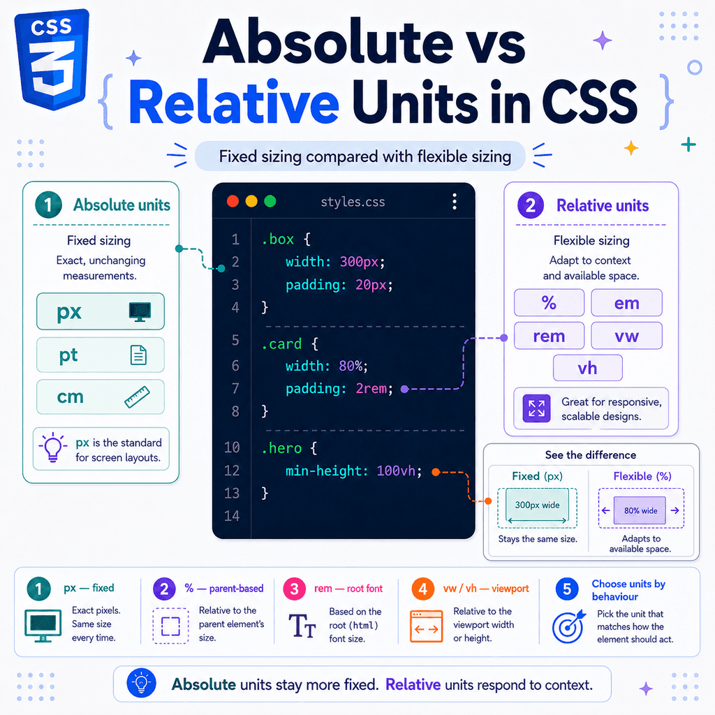
This is the main difference between absolute and relative units.
Absolute units are more fixed.
Relative units depend on something else, such as the parent size, the root font size, the current font size, or the viewport size.
Understanding this difference helps you choose better units for layouts that work across different screens, devices, and user settings.
What Are Absolute Units?
Absolute units describe a size that does not depend on another CSS value in the same way relative units do.
The most common absolute unit in web design is:
pxExample:
.box { width: 300px;}This tells the browser to make the box 300px wide.
The size is direct and predictable.
Other absolute CSS units exist too:
cmmminptpcpxBut for normal screen-based web design, you will mostly use px.
Units like cm, mm, in, pt, and pc are more common in print-related CSS than everyday web layouts.
What Are Relative Units?
Relative units are based on another measurement.
Examples include:
%emremvwvhvminvmaxchlhfrEach relative unit depends on a different reference.
For example:
.card { width: 50%;}The 50% value depends on the size of the parent or containing block.
Another example:
.title { font-size: 2rem;}The 2rem value depends on the root font size.
Another example:
.hero { min-height: 100vh;}The 100vh value depends on the viewport height.
Relative units are often useful for flexible and responsive designs.
Fixed Sizing vs Flexible Sizing
The core difference is:
Absolute units are usually better for fixed sizing.Relative units are usually better for flexible sizing.Fixed sizing means the size stays more controlled and direct.
Example:
.icon { width: 24px; height: 24px;}Flexible sizing means the size adapts to something else.
Example:
.container { width: 90%; max-width: 70rem;}The container changes size based on the available space, but it does not grow beyond a maximum width.
This is usually better for responsive layouts.
The px Unit
The px unit means CSS pixel.
Example:
.button { border-radius: 8px;}The browser applies an 8px border radius.
Pixels are straightforward.
They are useful when you want precise control.
Example:
.card { border: 1px solid #dddddd; box-shadow: 0 4px 12px rgb(0 0 0 / 0.15);}This is a good use of pixels.
Small visual details often work well with fixed pixel values.
When Pixels Are Useful
Pixels are commonly useful for:
bordersiconsthin linesbox shadowssmall fixed detailsborder radiusprecise spacing in small UI detailsExample:
.avatar { width: 48px; height: 48px; border-radius: 50%;}This gives the avatar a predictable size.
Another example:
.card { border: 1px solid #cccccc;}A 1px border is simple and clear.
When Pixels Can Cause Problems
Pixels can become a problem when they are used for large layout sizes without flexibility.
Example:
.card { width: 700px;}This might look fine on a desktop screen.
But on a phone screen, 700px may be too wide.
The card may overflow horizontally.
A more flexible version is:
.card { width: 100%; max-width: 700px;}Now the card can shrink on small screens.
It can still stop at 700px on larger screens.
This combines flexible and fixed sizing.
Fixed Width Example
HTML:
<div class=”card”> This is a card.</div>CSS:
.card { width: 500px; padding: 20px;}The card is always 500px wide.
On a wide screen, that may be fine.
On a narrow screen, it may overflow.
This is the risk of fixed width.
Fixed sizes are predictable, but they are not always adaptable.
Flexible Width Example
HTML:
<div class=”card”> This is a card.</div>CSS:
.card { width: 100%; max-width: 500px; padding: 1rem;}This card is more flexible.
It can fill the available width.
But it will not become wider than 500px.
This is a common responsive pattern:
width: 100%;max-width: fixed-size;It gives you flexibility and control at the same time.
The % Unit
The percentage unit is relative to another size.
For width, it is usually relative to the containing block.
Example:
.container { width: 800px;} .box { width: 50%;}The .box becomes 400px wide.
Why?
50% of 800px = 400pxPercentages are useful when an element should respond to its parent’s size.
Percentage Width Example
HTML:
<div class=”wrapper”> <aside class=”sidebar”>Sidebar</aside> <main class=”content”>Content</main></div>CSS:
.wrapper { display: flex;} .sidebar { width: 30%;} .content { width: 70%;}The sidebar uses 30% of the wrapper.
The content uses 70%.
This creates a flexible layout because the column widths adapt when the wrapper changes size.
Percentage Height Can Be Tricky
Percentage heights can be less intuitive than percentage widths.
Example:
.parent { height: 400px;} .child { height: 50%;}The child height becomes 200px.
But this may not work as expected:
.parent { /* no set height */} .child { height: 50%;}If the parent does not have a definite height, the browser may not know what 50% should be based on.
For full-height sections, viewport units are often clearer:
.hero { min-height: 100vh;}The em Unit
The em unit is relative to font size.
For many properties:
1em = the current element’s font sizeExample:
.button { font-size: 16px; padding: 1em;}The padding becomes 16px.
If the button font size changes to 20px, the padding becomes 20px.
This makes em useful for component sizing.
em for Scalable Components
HTML:
<button class=”button”>Save</button><button class=”button large”>Continue</button>CSS:
.button { font-size: 1rem; padding: 0.75em 1em; border-radius: 0.5em;} .button.large { font-size: 1.25rem;}The large button has larger text.
Its padding and border radius also scale because they use em.
This keeps the button proportions consistent.
This is a good use of relative units.
em Can Compound
When em is used for font-size, it is relative to the parent font size.
Example:
.parent { font-size: 20px;} .child { font-size: 1.5em;}The child font size becomes 30px.
Why?
1.5 × 20px = 30pxThis can be useful.
But nested em values can compound.
Example:
.list { font-size: 1.2em;}If lists are nested inside lists, each nested list can become larger than the last.
That may be intended, but it can also be accidental.
The rem Unit
The rem unit is relative to the root font size.
The root element is usually:
<html>If the root font size is 16px, then:
1rem = 16px2rem = 32px0.5rem = 8pxExample:
.card { padding: 2rem;}If the root font size is 16px, the padding is 32px.
Unlike em, rem does not depend on the local parent’s font size.
This makes it more predictable for site-wide spacing.
rem for Consistent Sizing
The rem unit is commonly used for:
font sizespaddingmargingapcontainer widthssection spacingExample:
body { font-size: 1rem;} .card { padding: 1.5rem; margin-bottom: 2rem;} .grid { gap: 1rem;}These sizes all relate to the root font size.
That makes them consistent across the page.
em vs rem
The difference is:
em = based on local font sizerem = based on root font sizeExample:
html { font-size: 16px;} .parent { font-size: 20px;} .child-em { font-size: 2em;} .child-rem { font-size: 2rem;}The .child-em font size becomes:
2 × 20px = 40pxThe .child-rem font size becomes:
2 × 16px = 32pxUse em when the size should follow local text size.
Use rem when the size should follow the root scale.
The vw Unit
The vw unit is relative to viewport width.
The viewport is the visible browser area.
1vw = 1% of the viewport width100vw = full viewport widthExample:
.hero { width: 100vw;}This makes the hero as wide as the viewport.
Another example:
.title { font-size: 8vw;}The title size changes as the viewport width changes.
This can create fluid typography.
The vh Unit
The vh unit is relative to viewport height.
1vh = 1% of the viewport height100vh = full viewport heightExample:
.hero { min-height: 100vh;}This makes the hero at least as tall as the viewport.
This is common for full-screen sections.
However, 100vh can be tricky on mobile browsers because browser interface bars can change the visible height.
Modern CSS includes newer viewport units such as:
svhlvhdvhFor mobile full-height layouts, you may use:
.hero { min-height: 100dvh;}Viewport Units Are Flexible
Viewport units are useful when a size should respond to the browser window.
Example:
.hero-title { font-size: 10vw;}If the viewport gets wider, the title gets larger.
If the viewport gets narrower, the title gets smaller.
But pure viewport sizing can go too far.
The title may become too small or too large.
A better approach is often:
.hero-title { font-size: clamp(2rem, 8vw, 5rem);}This gives the title a minimum size, a flexible preferred size, and a maximum size.
The ch Unit
The ch unit is based on the width of the 0 character in the current font.
It is useful for text line length.
Example:
.article { max-width: 65ch;}This means the article is about 65 characters wide.
That is useful because readable text is often better measured by characters than by pixels.
Compare:
.article { max-width: 700px;}with:
.article { max-width: 65ch;}The ch version is more connected to the actual text.
The fr Unit
The fr unit is used in CSS Grid.
It means a fraction of available space.
Example:
.layout { display: grid; grid-template-columns: 1fr 3fr;}This creates two columns.
The second column gets three times as much available space as the first.
The fr unit is relative because it depends on available space inside the grid container.
It is very useful for flexible grid layouts.
Absolute Units in Print
CSS includes units such as:
incmmmptpcExamples:
@media print { body { margin: 2cm; }}These units can be useful when designing for print.
For screen layouts, they are usually less common.
Most web interfaces use:
pxremem%vwvhfrThat is where beginners should focus first.
Fixed Sizing Example
A fixed layout might look like this:
.container { width: 960px;} .card { width: 300px; padding: 20px;}This is predictable.
The container is always 960px.
The card is always 300px.
The padding is always 20px.
But the layout may not adapt well to smaller screens.
On a phone, 960px is likely too wide.
Fixed sizing gives control, but it can reduce flexibility.
Flexible Sizing Example
A flexible layout might look like this:
.container { width: min(100% – 2rem, 70rem); margin-inline: auto;} .card { width: 100%; padding: 1.5rem;}This adapts better.
The container uses the available width.
It leaves space at the sides.
It does not grow wider than 70rem.
The card fills the container.
This is a more responsive approach.
Combining Fixed and Flexible Units
Good CSS often combines fixed and flexible units.
Example:
.card { width: 100%; max-width: 600px; padding: 1.5rem; border: 1px solid #dddddd;}This uses:
100% for flexible width600px for maximum fixed width1.5rem for scalable spacing1px for a precise borderThis is often better than using only one type of unit.
You do not need to choose absolute or relative units for everything.
You choose the unit that fits each job.
Absolute Units Are Not Bad
Absolute units are not wrong.
Pixels are useful.
Example:
.card { border: 1px solid #dddddd;}A 1px border is clear.
Another example:
.icon { width: 24px; height: 24px;}A fixed icon size may be exactly what you need.
The problem is not using pixels.
The problem is using fixed values where flexibility is needed.
Relative Units Are Not Always Better
Relative units are flexible, but they can also be confusing.
Example:
.child { width: 50%;}This depends on the parent.
If the parent is unexpectedly narrow, the child will be narrow too.
Another example:
.title { font-size: 10vw;}This may become too large on wide screens.
Relative units need context.
They are powerful, but they should be used deliberately.
Choosing Between Fixed and Flexible Units
Ask what the size should respond to.
If the size should stay precise, use a fixed unit.
Example:
border: 1px solid #dddddd;If the size should respond to the parent, use %.
Example:
width: 50%;If the size should respond to the root font size, use rem.
Example:
padding: 2rem;If the size should respond to the current element’s text size, use em.
Example:
padding: 0.75em 1em;If the size should respond to the viewport, use vw, vh, or related viewport units.
Example:
min-height: 100dvh;Responsive Design Usually Needs Relative Units
Responsive design means the layout adapts to different screen sizes.
Relative units are useful for this.
Example:
.container { width: min(100% – 2rem, 70rem);}This works on small and large screens.
Another example:
.grid { display: grid; grid-template-columns: repeat(auto-fit, minmax(16rem, 1fr)); gap: 1rem;}This grid adapts to available space.
The rem and fr units help the layout stay flexible.
min(), max(), and clamp()
CSS functions help combine fixed and flexible sizing.
The min() function chooses the smaller value:
.container { width: min(100%, 70rem);}The max() function chooses the larger value:
.box { width: max(20rem, 50%);}The clamp() function sets a minimum, preferred value, and maximum:
h1 { font-size: clamp(2rem, 6vw, 5rem);}These functions are very useful for balancing fixed and flexible sizing.
clamp() for Fluid Text
Example:
h1 { font-size: clamp(2rem, 8vw, 5rem);}This means:
The font size will not go below 2rem.It will try to scale with 8vw.It will not go above 5rem.This is better than:
h1 { font-size: 8vw;}because pure viewport text can become too small or too large.
clamp() adds control.
min() for Flexible Containers
Example:
.container { width: min(100% – 2rem, 70rem); margin-inline: auto;}This means:
Use the available width minus 2rem.But do not exceed 70rem.Center the container.This is a useful responsive container pattern.
It combines a flexible width with a maximum readable size.
Fixed Layout vs Responsive Layout
A fixed layout might use:
.page { width: 1200px;}A responsive layout might use:
.page { width: min(100% – 2rem, 75rem);}The fixed layout is always 1200px.
The responsive layout adapts to the viewport and has a maximum width.
For modern websites, responsive layouts are usually safer.
Fixed layouts can still be useful in controlled contexts, but they are less flexible.
Absolute Units and Accessibility
Using fixed pixel values for everything can reduce flexibility for users.
For example:
body { font-size: 12px;}This may be too small for many users.
A better default is often:
body { font-size: 1rem;}This respects the root font size.
If the user changes their browser font size, rem-based sizing can respond more naturally.
Use fixed text sizes carefully.
Relative Units and Accessibility
Relative units can support accessibility when used well.
Example:
body { font-size: 1rem; line-height: 1.6;}This creates readable text that can respond to user settings.
Another example:
.button { font-size: 1rem; padding: 0.75em 1em;}If the text size increases, the button padding scales too.
This helps the component remain usable.
Unitless Line Height
Line height is often best written without a unit.
Example:
body { line-height: 1.6;}This means the line height is based on the element’s font size.
If the font size changes, the line height changes proportionally.
This is usually better than:
body { line-height: 24px;}A fixed line height may not work well with different font sizes.
Common Mistake: Using Fixed Width Without a Maximum Strategy
This can cause overflow:
.card { width: 600px;}Better:
.card { width: 100%; max-width: 600px;}Or:
.card { width: min(100%, 600px);}These versions allow the card to shrink on small screens.
Common Mistake: Using 100vw for Normal Width
This can cause horizontal scrolling:
.section { width: 100vw;}Often, this is enough:
.section { width: 100%;}The difference is important.
100% usually means the width of the parent.
100vw means the width of the viewport.
On some pages, 100vw can include the scrollbar width and create overflow.
Common Mistake: Confusing % and vw
These are different:
.box { width: 50%;}and:
.box { width: 50vw;}50% depends on the parent or containing block.
50vw depends on the viewport width.
Example:
.container { width: 800px;} .box { width: 50%;}The box is 400px.
But:
.box { width: 50vw;}If the viewport is 1200px, the box is 600px.
The parent may not matter.
Common Mistake: Confusing em and %
Both are relative, but they are not the same.
Example:
.child { font-size: 120%;}This means the child font size is 120% of the parent font size.
This is similar to:
.child { font-size: 1.2em;}But for other properties, percentages and em may use different references.
Example:
.box { padding: 10%;}Percentage padding often depends on the containing block width.
But:
.box { padding: 1em;}em padding depends on the element’s font size.
Different relative units respond to different things.
Common Mistake: Overusing em for Font Sizes
This can compound:
.menu { font-size: 1.1em;}If menus are nested, each nested menu may become larger.
If you want consistent sizing, use rem:
.menu { font-size: 1.1rem;}Use em when compounding is acceptable or useful.
Use rem when you want a consistent scale.
Common Mistake: Pure Viewport Font Sizes
This can be too extreme:
h1 { font-size: 10vw;}Better:
h1 { font-size: clamp(2rem, 10vw, 6rem);}The clamp() version keeps the size within a useful range.
It is flexible without becoming uncontrolled.
Practical Example: Fixed Card
HTML:
<article class=”card”> <h2>Fixed Card</h2> <p>This card uses fixed sizing.</p></article>CSS:
.card { width: 360px; padding: 24px; border: 1px solid #dddddd;}This card is predictable.
But it may not adapt well to narrow screens.
It is best used when you know the available space.
Practical Example: Flexible Card
HTML:
<article class=”card”> <h2>Flexible Card</h2> <p>This card adapts to the available space.</p></article>CSS:
.card { width: min(100%, 36rem); padding: 1.5rem; border: 1px solid #dddddd;}This card can shrink on small screens.
It does not grow beyond 36rem.
The spacing uses rem, which connects to the root font size.
This is usually more suitable for responsive layouts.
Practical Example: Fixed Button
HTML:
<button class=”button”> Save</button>CSS:
.button { font-size: 16px; padding: 12px 16px;}This button has fixed text size and fixed padding.
It is simple.
But if you later create a larger button, you need to manually adjust the padding too.
Practical Example: Flexible Button
HTML:
<button class=”button”>Save</button><button class=”button button-large”>Continue</button>CSS:
.button { font-size: 1rem; padding: 0.75em 1em;} .button-large { font-size: 1.25rem;}The large button automatically gets larger padding because the padding uses em.
This makes the component more flexible.
Practical Example: Fixed Text Width
CSS:
.article { max-width: 700px;}This gives the article a fixed maximum width.
That may work.
But the readable line length depends on font size.
If the font changes, 700px may not represent the same number of characters.
Practical Example: Flexible Text Width
CSS:
.article { max-width: 65ch;}This uses character-based width.
It keeps the article line length closer to a readable text measure.
This is often useful for blog posts, documentation, and long-form text.
Practical Example: Responsive Section
HTML:
<section class=”hero”> <h1>Flexible CSS Units</h1> <p>Choose units based on how the design should respond.</p></section>CSS:
.hero { min-height: 100dvh; padding: clamp(2rem, 8vw, 6rem); display: grid; place-items: center;} .hero h1 { font-size: clamp(2.5rem, 8vw, 6rem);} .hero p { max-width: 60ch; line-height: 1.6;}This section uses relative and flexible sizing.
The height responds to the viewport.
The padding scales with viewport width but stays within limits.
The heading scales within limits.
The paragraph width is based on readable line length.
Practical Example: Responsive Grid
HTML:
<div class=”grid”> <article>One</article> <article>Two</article> <article>Three</article></div>CSS:
.grid { display: grid; grid-template-columns: repeat(auto-fit, minmax(16rem, 1fr)); gap: 1rem;}This grid adapts automatically.
Each column is at least 16rem.
If there is more space, columns share it using 1fr.
This is a good example of flexible sizing.
Practical Example: Mixed Units
CSS:
.card { width: min(100%, 40rem); padding: 1.5rem; border: 1px solid #dddddd; border-radius: 12px;} .card h2 { font-size: clamp(1.5rem, 4vw, 2.5rem); margin-bottom: 0.5em;} .card p { max-width: 60ch; line-height: 1.6;}This uses:
min() for flexible maximum widthrem for consistent spacingpx for precise border and radiusclamp() with vw for flexible heading sizeem for heading-related spacingch for readable paragraph widthunitless line-heightThis is often how good CSS works.
It combines units based on purpose.
Absolute vs Relative Unit Examples
Fixed size:
.box { width: 300px;}Parent-relative size:
.box { width: 50%;}Root font-relative size:
.box { padding: 2rem;}Current font-relative size:
.button { padding: 0.75em 1em;}Viewport-relative size:
.hero { min-height: 100vh;}Grid-relative size:
.grid { grid-template-columns: 1fr 2fr;}Each unit answers a different question.
Which Unit Should You Use?
Use this guide:
Use px when the value should be precise and fixed. Use % when the value should depend on the parent or containing block. Use rem when the value should follow the root font size. Use em when the value should scale with the current element’s text. Use vw or vh when the value should depend on the viewport. Use dvh when you need viewport height that adapts better on mobile. Use ch when width should follow readable text length. Use fr when dividing available space in CSS Grid.There is no single best unit.
There is only the best unit for the behaviour you need.
Best Practices
Use fixed units for small precise details.
Use relative units for responsive layouts.
Avoid fixed pixel widths for large page containers unless you also provide responsive limits.
Use width: 100% with max-width for flexible containers.
Use rem for consistent spacing and typography.
Use em for component spacing that should scale with text.
Use % when a size should depend on the parent.
Use viewport units carefully, especially 100vh on mobile.
Use clamp() to control flexible sizes.
Use unitless line-height.
Use 0 without a unit.
Combine units instead of forcing one unit everywhere.
Quick Reference
Absolute unit: pxA fixed CSS pixel. Useful for precise details such as borders, shadows, icons, and small fixed sizes. Relative units: %Relative to another size, often the parent or containing block. emRelative to font size. Useful for component parts that should scale with text. remRelative to the root font size. Useful for consistent spacing and typography. vwRelative to viewport width. vhRelative to viewport height. dvhRelative to dynamic viewport height. Useful for mobile full-height layouts. chRelative to the width of the 0 character. Useful for readable text widths. frA fraction of available space in CSS Grid.Quick Summary
Absolute units create more fixed sizing.
Relative units create more flexible sizing.
Pixels are the most common absolute unit for screen design.
Pixels are useful for borders, icons, shadows, and precise details.
Relative units depend on another value, such as the parent size, root font size, current font size, viewport size, or available grid space.
Percentages depend on the parent or containing block.
em depends on font size and is useful for scalable components.
rem depends on the root font size and is useful for consistent spacing.
vw and vh depend on the viewport.
ch is useful for readable text widths.
fr is useful in CSS Grid.
Fixed sizing gives control.
Flexible sizing gives adaptability.
Most good CSS uses both.
Choose the unit based on what the size should respond to.